Sophia is discussing usability testing with her client and can’t wait to get started. The only problem is that they’ve got different ideas on what to test and which areas of the website to focus on. Sophia’s client has knowledge of his customers, while Sophia has got years of UX experience to base her testing tasks on. With no sign of an agreement between Sophia and her client she turns her attention to analytics to gain some insight into how people are really using the website.
Usability testing and analytics make for a dynamite team, enabling us to learn about our users, track our goals, and troubleshoot unexpected problems. When it comes to troubleshooting, analytics tell us what pages or journeys are causing problems for users, and helps identify what areas we should focus on in usability testing. The usability tests will then tell us why users are behaving in those specific ways. Between the two, we can provide focused, user-specific recommendations for site owners.
In the case of Sophia (and many other UX practitioners like her) analytics show exactly how users are accessing the website. Though her background in UX, and her client’s customer know-how might have resulted in good assumptions about what to test, analytics showed them how people were using the website in a clear, unbiased way.
For anyone willing to learn a few simple tools to read them, analytics helps:
- identify problem areas on a website
- show how users are engaging with a site
- measure the results of any design improvements
In this two-part series, I’ll explain how to use analytics to identify where users are having issues, and what areas of a site will most benefit from usability testing. Today’s article focuses on three metrics to identify problems on a web site: bounce and exit rate, average time on page, and page value. In part two, we’ll move on to using these metrics to identify drop off points, and then we’ll dig into segmenting the data to pick up on additional details.
Identifying problem pages and sections
As a freelance UX consultant, I’ve worked on a wide range of websites across multiple industries, and the process consistently begins with analytics. I start by identifying how many users visit the site daily, and which pages are the most popular. This gives me an overview of how people are using the site. I then move on to identifying potential problem areas, which will later become the focus of my UX recommendations.
In general, I look at three types of metric to identify problem areas:
- Bounce and Exit rate
- Average time on page
- Page value
Bounce and Exit rate
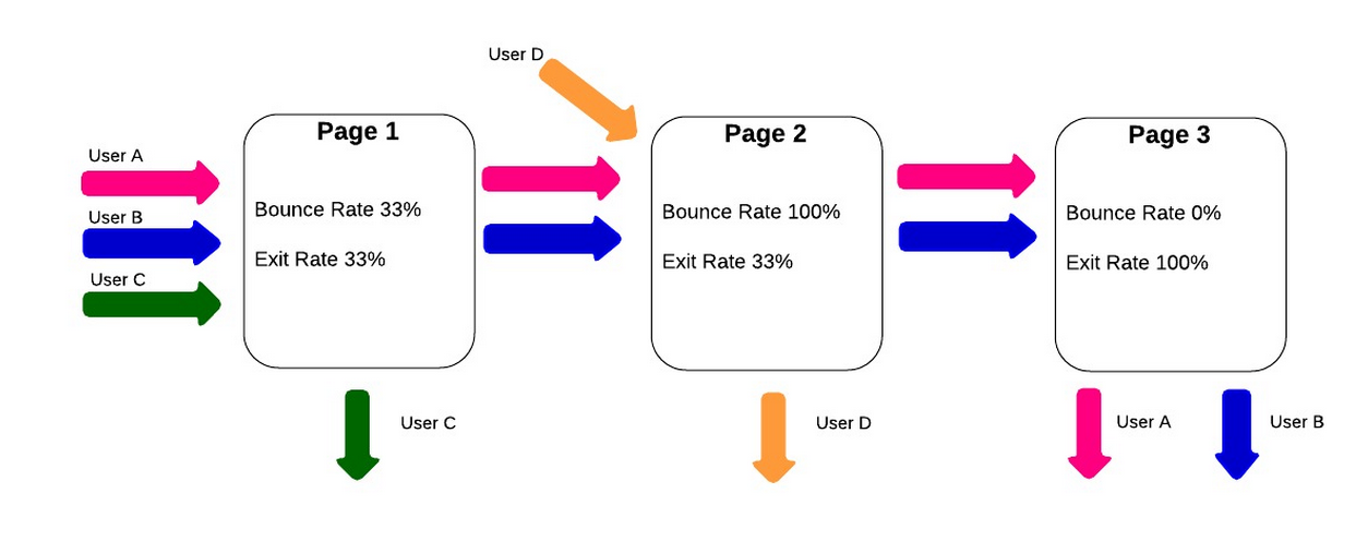
“Bounce rate” and “exit rate” are two metrics that can cause confusion. Bounce rate is the percentage of users who visited just that one page of a site: arriving on a page but then leaving without viewing any other pages on the site. Exit rate is the percentage of people who leave the site from a page; this includes people who have visited other pages on the site previously.

If I notice a section of the website that shows a high bounce or exit rate, I make note of it, in case something on a particular page is driving away visitors. A page with a high bounce rate may indicate that the content on the page wasn’t what the user was expecting when they arrived there. A high exit rate may show that this page is causing the user to drop out part-way through their intended journey—on the other hand, if the page with the high exit rate is the final page in the journey, then the exit rate is not a problem at all.
Using the “weighted sort” option in Google Analytics makes the bounce rate metric even more valuable. According to Google Analytics “Weighted sort sorts percentage data in order of importance instead of numerical order.” To give an example, a page may have a 100% bounce rate, but if it only had one visit in the last month then only one person left the page (and a bigger issue may be that no one is visiting the page!). If the page has an 80% bounce rate, but is a key starting page in the user journey, then the site could be losing a lot of business. Recognizing whether the problem is that no one is visiting the page or that everyone visiting immediately leaves the site is crucial to preparing an appropriate usability test around the page in question.

Average time on page
“Average time on page” is the average amount of time that users spend viewing a webpage. If I see a page with a low “average time on page,” it may mean the page is under-performing by not holding the user’s attention. On the other hand, if users are spending a lot of time on a checkout page, it might be because the page is overly complicated. Of course, all metrics should be viewed in context; if a blog article has a high “average time on page,” it’s generally a good sign, since it may imply that users are actually reading the whole post.
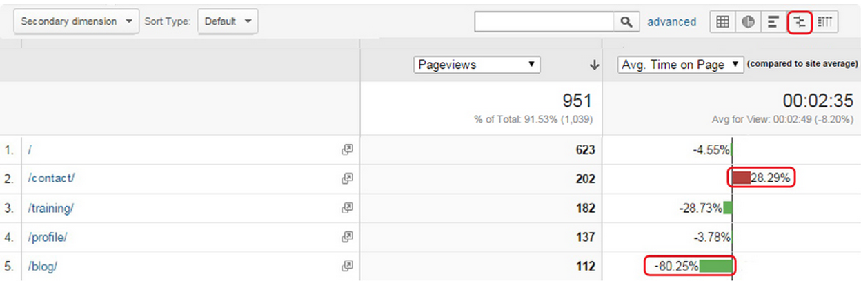
Another good way to quickly gauge how pages are performing is to use the “compare to site average” display option. This is a graph that shows whether pages are significantly above or below average for the selected metric. They will still need to be analyzed on a page by page basis, as different pages have different objectives, but pages with a lower than average time on page are likely to be an issue, assuming the purpose is to keep users reading. The example below clearly shows that the “Contact” page has a lower time on page than the site average, while the “Blog” page has a time on page of over 80% higher than the average.

Again, context is key here. Users may be arriving on the contact page to check the address of a company, or to find their phone number. If they successfully achieve this then they will leave the site, so a low time on page here can be good sign that the page is performing efficiently. A “blog” page is expected to hold a users’ attention, so the higher than average time on this page could be seen as a good thing.
Page Value
An important, but underused, metric for spotting poorly performing pages is “page value.” Page value, as the name suggests, is a way to give a single web page a direct monetary value. It pulls the values in from a combination of transaction revenue, for ecommerce sites, and goal value for all other types of websites, both of which need to be set up manually in Google Analytics for a page value to be calculated. A high page value will often be a sign of an important page, which indicates that it is a good page to focus on during usability tests.
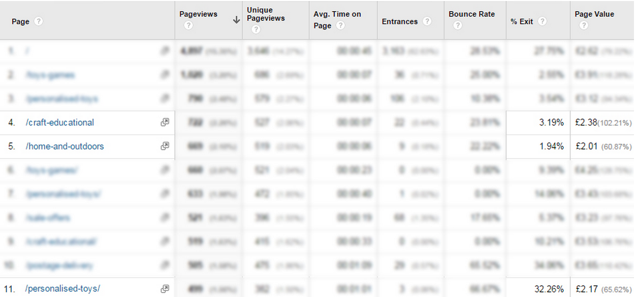
High value pages that show a high exit rate are a good area to focus on for improvement. These are pages where users are dropping out at a key part of their journey to conversion. In the example below, taken from an ecommerce site, I’ve highlighted three categories with a similar page value. It is clear to see that there is a far higher exit rate for the Personalised Toys product page. This shows that this is a high value page that’s “leaking” users, and should be the focus of future UX work.

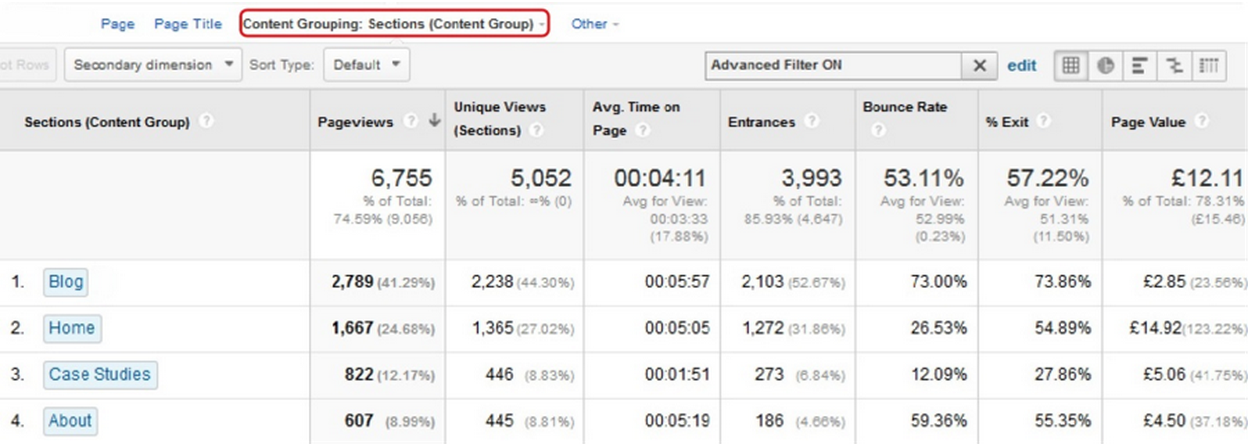
Looking at individual pages will only show part of the picture though. It’s important to use the “content grouping” feature to look at how whole sections of a website are performing. Content grouping is essentially a way to segment data by the types of pages that users visit on a website. Pages can be grouped in a variety of ways. For a site that sells clothing, for example, groups could be set up for each type of clothing, showing whether pants have a higher page value than shirts!
Once a page or section has been identified as having a low page value the next step would be to find out why this might be the case. In the example above it’s been shown that shirts have a comparatively low value. My first step here would be to look for any clear UX or technical issues on the shirts pages, using my experience and judgement. After doing this I would test the page, or pages, with real users to see why they are experiencing these issues—and look for clues indicating how we would fix them.

Content Grouping can be a really powerful way to see how different parts of a website are performing.
Using Metrics in Practice
This is the first step in using analytics to identify website problems. In the second part of this series, we’ll look at how to identify drop-off points in the user journey and how to segment users to see more details.
In the meantime, try identifying potential problems using the methods from this article:
- Pull up the bounce rate to find pages users land on and immediately leave.
- Read through the exit rate of pages to see where in the customer journey users leave the site.
- Factor in the importance of a user’s average time on a page—a high bounce rate on a blog page, combined with a long average user time is actually a good thing!
- Look at the pages ranked by page value. The higher the page value, the more important it is to usability test, and ultimately fix problems users are having on the page.