
There are plenty of tools and services out there for measuring useful statistics when doing research on websites. I’m often surprised to see people choose expensive tools with limited capability over Google Analytics.
It’s true that Google Analytics feature set can seem a bit daunting, but if you invest a little time learning about it, Google Analytics can really be a valuable tool for user experience designers. As an added bonus, many sites already have it installed, which means that if you’re walking into a new project, you might already have a plethora of historical data waiting to be analyzed.
In this post, I’m going to share a few easy-to-use features Google Analytics boasts that aren’t always self-evident to newer users of the software.
Use the different data views
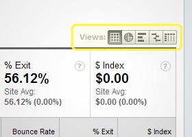
In many of Google Analytic’s reports it’s possible to switch the presentation of data. Sometimes, this is useful for viewing data in a more ideal way, while other times a different view can reveal entirely new information about a website.
Switching views is simple. Directly below the date range area of a report, on the right side of the page, you’ll notice a set of buttons that can be used to tab through table, percentage, performance, comparison and pivot views.
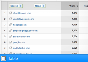
Table view
The Table view is typically the standard data view when going over statistics. This view organizes data in a very straightforward spreadsheet-like manner.
This view is useful as a general overview for many types of values for specific dimensions. For example, on the default Top Content page (Content → Top Content), it’s possible to easily digest Pageviews, Unique Pageviews, Avg. Time on Page, Bounce Rate, etc. for individual pages on a website.
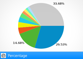
Percentage view
Sometimes it’s easier to understand sets of data using visual tools like pie charts. With the percentage view, it’s possible to get a good idea of how values stack up against each other in just a glance.
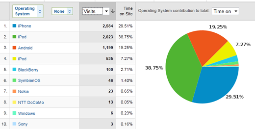
In the example below, Mobile Devices is being viewed in the Percentage view. We’ve ordered the items by Visits, and have told Google Analytics to calculate the percentage of total time each mobile device accounts for. In other words, in just a quick glance, we can see that iPhone, iPad and Android users account for over 75% of the total time mobile users spend on this site.
Performance view
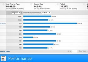
The Performance view is another tool for visualizing data. It can be useful for analyzing some metrics where the Percentage view fails to do so.
For example, it might make sense to use the Percentage view to visualize the total number of visits to a website from different referrers. However, if you wanted to see Pages per Visit, the Performance view would be the ideal way of presenting that data.
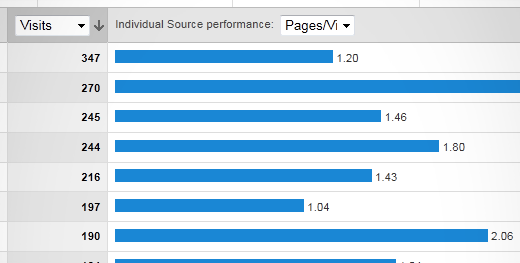
An example of how the Performance view displays Pages per Visit from different referrers, and measures them against each other.
Comparison view
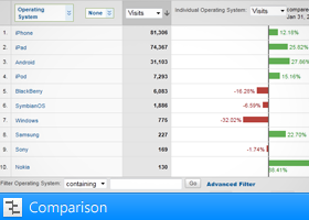
The Comparison view is a very useful visualization for comparing data against each other. With this data view, it’s possible to quickly visualize scenarios like: “What is the bounce rate of a page compared to the site average?”, “What is the average time spent on a page compared to the site average?”, or even “How many users are browsing using an iPad compared to this month last year?”.
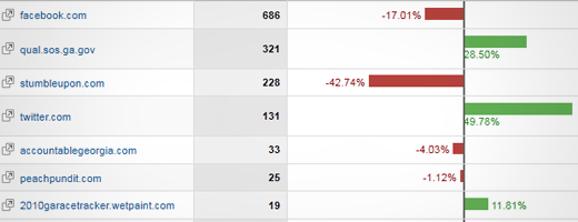
By default, the Comparison view compares metrics against a sites average for that particular metric, but you can also compare against your sites history if you enable “Compare to Past in the Data Range section of Google Analytics.
In the example below, we can see the percentage above or below the site average of Pages per Visit from different referring sites (ordered by Visits/source).
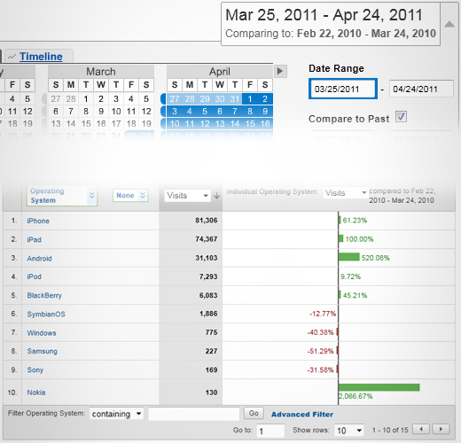
While in the following example, Compare to Past is enabled, so metrics are compared given historical data rather than current site average. This example shows Mobile device growth/decline percentages by number of Visits per device.
Pivot view
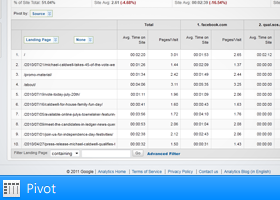
The Pivot view is an exceptional way to view multiple dimensions of data at once, which can be especially useful for finding otherwise hard-to-spot trends.
For instance, you could Pivot by Source, and then view Avg. Time on Site & Pages/Visit from different sources to specific landing pages. This might be useful in seeing what landing pages are most successful for certain sources, and which landing pages need work (or should be avoided) from specific sources.
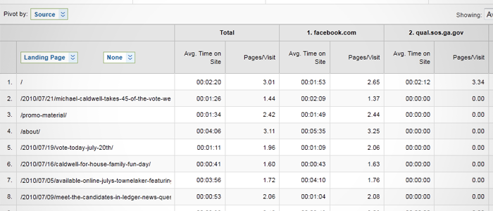
Using the Pivot view to show “Avg. Time on Site” & “Pages/Visit” for different landing pages from different sources.
Use Regular Expressions to filter data
Regular expressions (or regex) provide a means for matching patterns in strings of text. In Google Analytics, they can be used to match specific groups of URL’s allowing savvy users to quickly sort through data that matches specific criteria.
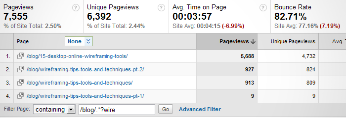
In this example, we’ve filtered results to show urls under /blog/ ONLY if the word “wire” can be found somewhere afterwards.
For example, say you’re analyzing data for a coffee publication, but you only wanted to go through pages with the phrases “French Press”, “Manual Drip”, and “Espresso” in the title. You could go to Content → Content by Title, and filter through pages using the regular expression: (French Press | Manual Drip | Espresso).
Another Example: Suppose that the site you are analyzing parses searches using a structure like /search.php?s=[search query]. You could filter results of data by using the expression “/search.php\?s=” (Note that a ‘\’ precedes the ‘?’ to indicate that the ‘?’ should be treated as a regular character instead of a regular expression wildcard.). If you wanted to see all searches containing the word “espresso”, you could use “/search.php\?s=.*?espresso“.
There is a brief write-up on using regular expressions in Google Analytics on Analytics Help that may help get you started using regex.
Learn about your mobile visitors
Google Analytics makes it easy to analyze mobile viewers of your websites. In fact, there is an entire section that is dedicated to “Mobile”.
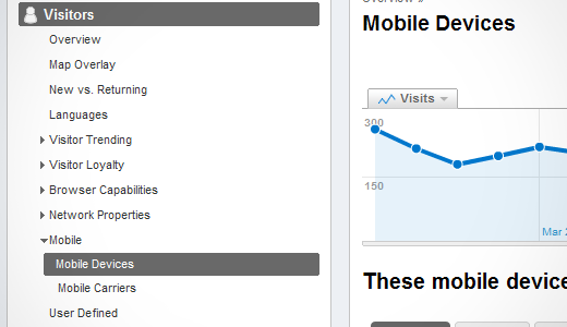
If you’re using the current/old Google Analytics Dashboard, you can find the Mobile dashboard by going browsing to Visitors → Mobile → Mobile Devices. Here, you’ll get a breakdown of what handheld devices are visiting your properties, along with the same sorts of controls found throughout the other parts of Analytics.
Use "Navigation Analysis" on key pages
Say you’ve filtered your results down in Top Content, but now you really want to inspect the details of a specific page. Perhaps you’re interested in learning more about how users are coming to a certain page, and where they go next.
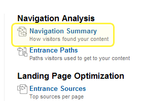
If you click on a specific page under Content, you actually have the ability to see such information. Simply click on Navigation Summary under Navigation Analysis.
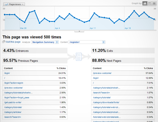
From the Navigation Summary page, we can see how many times a page was viewed, how many times the page was directly accessed vs. traveled to from a previous page, and where most people came to that page from (and where they went next). This is especially useful for seeing if pages with specific goals are doing their job adequately, while also providing insight into possible problems.
Are you using Google Analytics?
While the tips shown here may be new to you if you haven’t dug around in Analytics too much, any seasoned Google Analytics guru can tell you that this just barely scratches the surface of what Google Analytics is capable of. Do you ever use Google Analytics to research the sites you work on? How has it been instrumental to a projects success?