When I turned 16, I developed my first Business Intelligence database integrator and simultaneously received an education in the frustrations of the data analytics world. I found that preparing data for analysis, as well as analyzing it, was a cumbersome, error-prone and time-consuming process. In fact, even years later, it is estimated that 80% of data analysts’ time is spent just on data preparation. What if analyzing data could be more spontaneous? What if people could try out one idea after another, running unanticipated questions, and getting results immediately, regardless of data complexity?
Creating that new world of agile, simple analytics even when data is complex, big and disparate is what I have been doing ever since. My team at Sisense creates products to take the technical and make it intuitive.
In this article we’ll review the ways we do that, including 4 key principles for displaying data to make it usable. While the case study is for designing business intelligence (BI) software, the tactics are useful for anyone who uses analytics to inform the user experience.
The Trouble with Business Analytics
The field of business analytics software contains a sort of inner paradox: while it is meant to provide a product that caters to a less technical crowd of business executives and users, the process of preparing and analyzing large amounts of data is usually too complex for those business users to handle.
The result is that many users who actually need business intelligence and data analytics in their day-to-day jobs are incapable of using the products to their full potential. Instead, businesspeople and analysts rely on the technical department to prepare data, dashboards and reports, often with no opportunity to give their input, influence the process, or flexibly explore data.
Given the importance of data in today’s business world, a company’s greatest aspiration is for teams to take the initiative to analyze data and uncover insights to help the company better sell, develop, and understand their product or service. Product managers, developers, and UX designers in the BI and data analytics industry are learning how to bridge this gap by changing two key items:
- The way the product is designed
- The manner in which data is visualized inside the product
This evolution allows users with a range of know-how to navigate technical products and understand data analysis at a glance, thereby gaining more control in their jobs and adding greater value to their companies.
What Makes a Data Analytics Product
Data analytics and business intelligence (BI) software gives businesses a way to gather, visualize, and analyze their data in dashboards and reports. Leading BI tools range from companies that just provide data visualizations, such as Tableau, to tools that are standalone solutions, such as Sisense and Qlik, which provide both data management and dashboarding.
When businesses can see and understand they data, they gain insights into factors that drive or inhibit their business. Ultimately, this allow them to make better decisions.

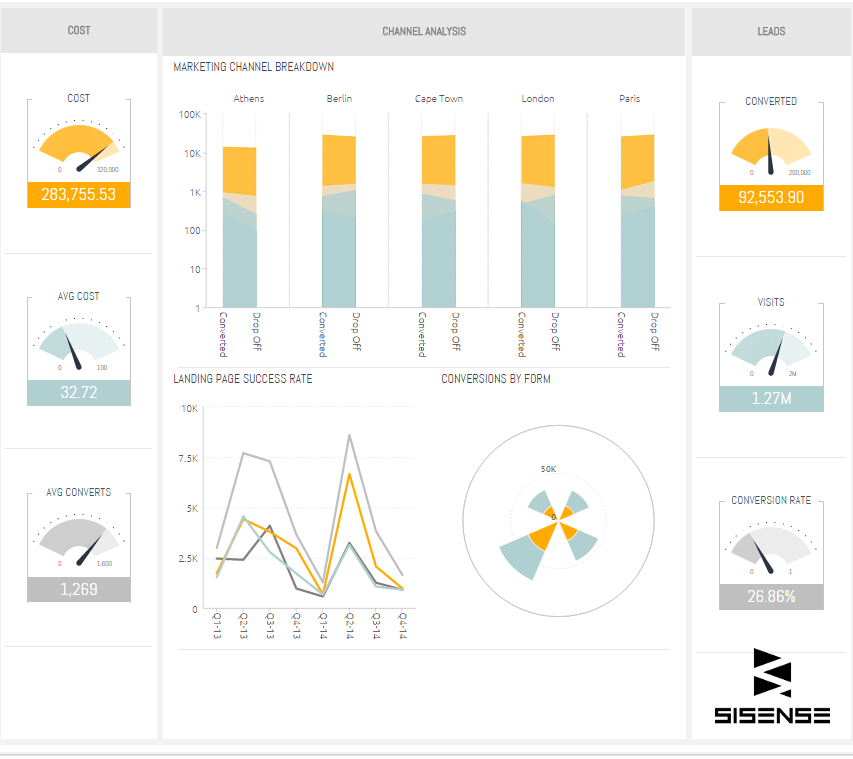
Sisense Marketing Dashboard

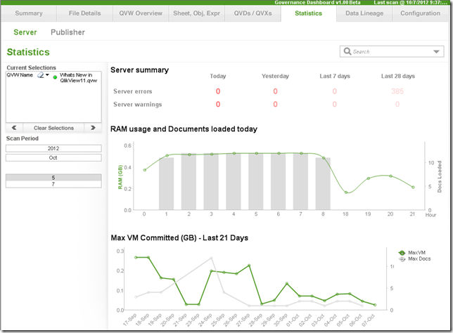
Qlik Governance Dashboard
Yet, there are many challenges to analyzing data that most BI products continue to struggle with, which we’ll review in this article. Most of them come down to the overarching challenge of usability. Like most technical products today, data analytics and BI software aspire to turn technical products into intuitive ones—especially when it comes to data visualization and dashboard design.
Let’s explore four ways to improve usability for all analytics and BI programs.
1. Basic first, advanced second
The Pareto Principle, named for an Italian economist, suggests that oftentimes 80% of effects come from 20% of causes. This principle can be applied to user experience: most users come to an application to use a small subset of features. Designers can assist the user by displaying those key features, which helps to declutter the UI and emphasizes the basic or recommended functionality of the product. Specialists can still access the more advanced features via keyboard commands or the menu, but those actions can take a backseat to buttons, visuals, or links that get used daily.
For example, when designing the report and dashboard creation widget of a business analytics program, a designer has the choice to display an array of colors or default to gradients of the same color. While it may seem more “feature rich” and desirable to offer all colors, this is setting your user up for a bad end result.
The end user may not realize that when displaying a bar or scatter chart, the best way for users to understand their data is if the user chooses a color gradient of a single color to make higher numbers appear darker and lower or negative numbers appear increasingly lighter. A single color that becomes lighter or darker based on quantity adds a dimension of meaning that is easily digestible to the human eye and distributes value more obviously.
By providing the end user with fewer, but thoughtful, options, you are simultaneously providing the user with a simpler experience and offering some best practices. Sisense business intelligence software and Tableau data visualization software both put more essential and best practice formatting features at the front of their products, to give users direction when they are trying to design a useful, intuitive dashboard.
2. Use data to an advantage
In the business intelligence world, users gain insights about their own product by combining and analyzing different data sources, such as data from a CRM with Google Analytics, to see how their customers are using the product.
The product development team at Fiverr (the world’s largest online marketplace for creative and professional services) for example, tracks and analyzes user behavior across their 4 million services, to get crucial insights about their UX.
When we’re designing BI software, we use those same techniques. Collecting and analyzing data from support forums and documentation page visits help us better understand which aspects of a current product are creating problems for users, and where the product needs to change or grow. With that knowledge garnered from bug reports, customer issues, and feature requests, we are better equipped to filter bugs, prioritize development, and improve the R&D workflow.

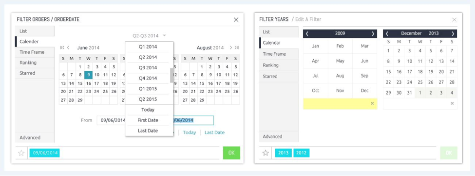
Before and after changing Sisense’s calendar view
Recently, we analyzed feature requests, questions, comments, and documentation views of our product and found that our calendar was creating a buzz of confusion. To get to the root cause, we created a word cloud for visualization and discovered that many users were having issues with the “date filter” in the calendar. Users thought this feature allowed them to select an entire month, when really it was just a navigation overview. After a quick redesign of the calendar, we resolved the problem and improved the user experience. By integrating this transparency into the R&D department, our product UX is tweaked on a regular basis to ensure we’re providing the best usability possible.
3. Embed proper data analytics
Embedded data analytics software integrates analytics and reporting capabilities into an existing application and provides customer-facing BI dashboards. The beauty of using such software is it directly connects to the multiple data repositories, pulls and processes the data, and allows both your internal users and your clients to analyze it from there.
Often people assume that it’s enough to rely on the analytics provided separately by various services and products. But while some non-BI tools incorporate data visualizations into their own platform, such as with Salesforce or Zendesk, users are restricted to seeing only the data of that service, instead of gaining a bigger picture by combining that data with other sources, (i.e. viewing Salesforce data with Google Analytics data).
If there is no real BI tool available, users are forced to export data to Excel in order to answer questions that require information from multiple data sources. While this is a viable solution, Excel doesn’t scale well and requires a lot of manual work, which is time consuming and increases the likelihood of human error. If analyzing the data takes too long, it can’t actually impact the decision-making process.
To address this problem, the ideal BI software should automatically streamline the process of combining and analyzing data from multiple sources. This allows data analysts to access the information in a clean state much faster, so they spend their time on actual analysis.
4. Visualizations must be interactive
Data visualizations attempt to present information in a way that helps the brain to understand correlations, trends, and outliers at a glance. A static graph illustrates one piece of information well, but the user cannot garner any other answers from it. When reports and dashboards are interactive, users can drill down into different segments, explore a specific correlation, and glean insights. In this way, users can easily analyze data, zoom out to the bigger picture and capture the smallest detail. Exposing users to the tools they need to run visualizations directly on the data is an incredible UX boost.

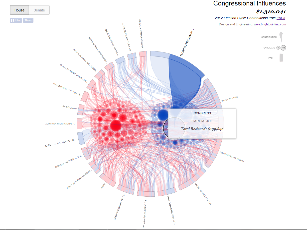
Source: D3 Gallery
For example, this data visualization of Congressional Influences taken from GitHub wiki shows the campaign contributions of political action committees (PAC). This interactive dashboard tells a story: the amount of money donated does not overshadow the number of supporting groups. Even though Florida Freedom PAC raised a whopping $140 grand for candidate Joe Garcia, Charles Wilson, due to the number of groups supporting his campaign (hence the darker color), has significant support. A simple hover, selection, or just rolling the mouse over a UI element allows the user to explore any aspect of the image and understand the data instantly and more accurately.
Create intuitive BI products
Business intelligence is a crowded market place, and as companies recognize the value of data visualization, they are increasingly incorporating data analytics into the product or building their own “analytics” feature as part of the product. Either way, improving upon how users interact with data visualizations and making it intuitive for all users, regardless of their technical savvy, is essential. As UX designers and product developers it’s key that we continue to learn the best practices, and explore new ways to display data.
- One of the most popular places to learn more about intuitive data visualization is this open source visualization library in JavaScript.
- Make sure your product runs well on mobile by implementing responsive design. The blog Codrops offers tutorials about best mobile practices.
- Make dashboards and reports web-based, giving your users the ability to share their work and insights with dozens of users.
- Pay attention to user feedback and analyze it for insights. See what changes can be implemented in the next development cycle–instead of waiting for the big product release. This allows companies to learn and succeed quickly as they leverage data to improve the value to their users and product.
Analytics is more than just a numbers game. It's a way of tracking and analyzing user behavior over time. In this article, we explore this intersection of user experience and data, so that budding designers can add productive web analytics to their process.