Never before have companies received as much feedback from their customers as today. Take mobile apps: we get data about acquisition from the app stores, behavior inside the app from analytics systems, and – not least – handcrafted comments and ratings from real users in app store reviews. Hidden in this ocean of data are many valuable gems of information.
Every day millions of users share their reflections in app store reviews. They express their irritation or excitement, often in hope of contributing to app improvement. Many design and development teams use this information to locate and fix bugs, and some even respond and engage their users. However, app reviews are rarely analysed in a structured way. Consequently, they don’t have a place in the UX product design cycle, and they aren’t considered a part of user research.
In this post, I share a simple and effective methodology for getting actionable feedback from thousands of app store reviews. First, I’ll walk thru a case study: a review my company, flexponsive, did of an airline app. Then I’ll dig deeper, and provide easy-to-follow steps for designers and product owners to analyze their own apps.
KLM airline app case study
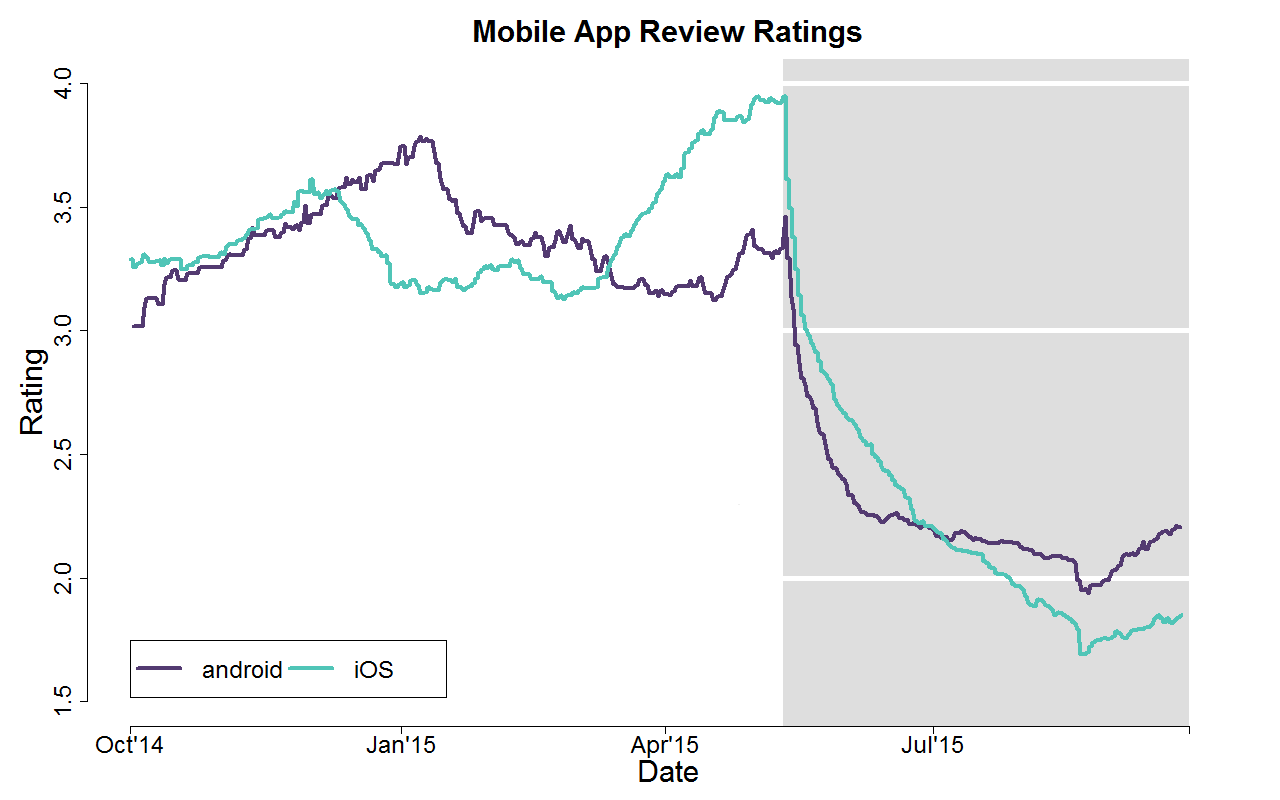
flexponsive has a strong focus on airline e-commerce, and we’ve seen many airlines heavily criticized for their mobile app and mobile website quality. Lately, app quality is starting to improve. When we saw the Dutch flag carrier KLM launch a new, ambitious, yet ultimately unsuccessful app upgrade, we decided to investigate. The airline, we noticed, actually moved from being an industry leader to the bottom of user satisfaction ranking tables! Though in this case study we analyzed the reviews as a pet project, we’ve used this process for clients as well, and found it both insightful and productive.

KLM, a former airline app quality leader, upgraded their app with terrible results.
To find out what happened with KLM’s app, we analysed in detail all the App Store reviews written in English in the last year. We identified the eight most important app features and analysed user sentiment towards each feature, based on the reviews.Then we summarised user sentiment and the frequency of user comments on two plots, to compare the old app and the new.

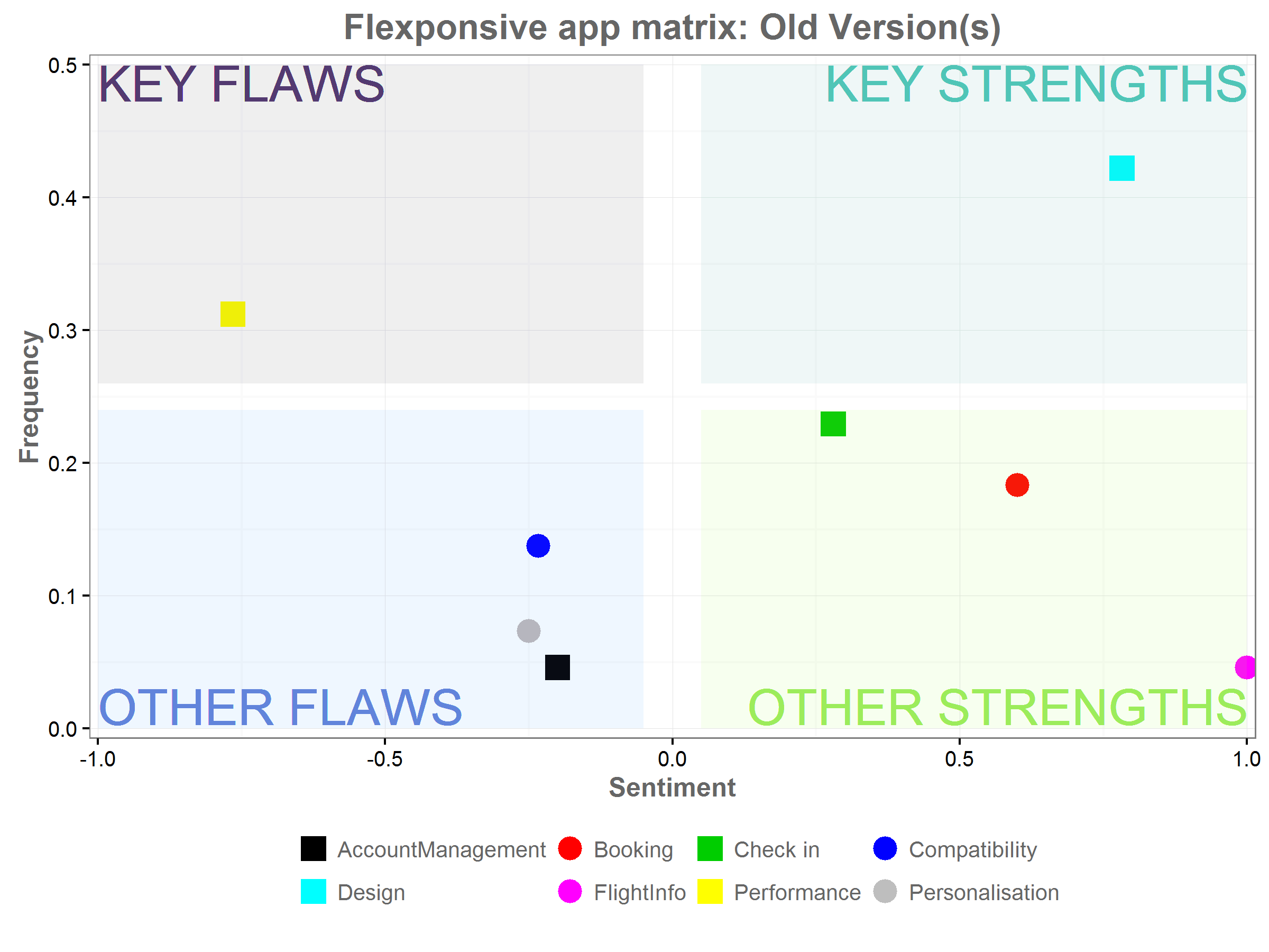
A graph showing the key flaws, key strengths, other flaws, and other strengths of the old KLM app.
In the graph, a position further to the right represents positive reviews, such as “Works well and very nice option to scan your passport!!!!” The higher up a feature is on the frequency axis, the more frequently it was mentioned in reviews.
Looking at the graphs, it’s clear that KLM’s old app had a very strong design. 45% of users positively referenced the look or the navigation. Several key features—booking, check in and flight info—were also mentioned positively. The app’s biggest problem was performance, with more than 30% of users complaining about app speed and instability. Judging from app reviews, it seems the performance should have been the focus of the update.

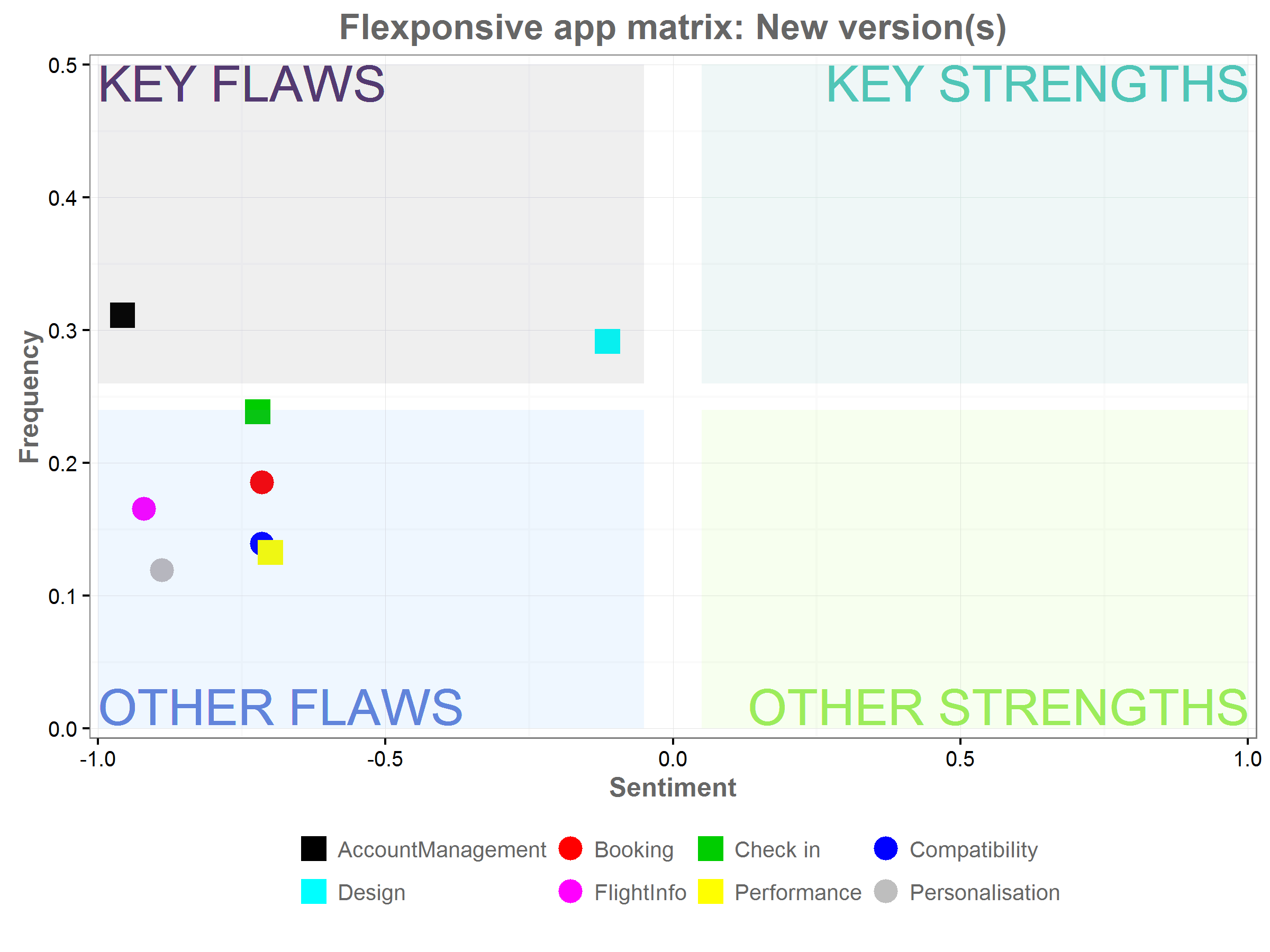
A graph showing the strengths and flaws of the revised KLM app.
Unfortunately, according to a graph of the app reviews post-upgrade, nearly all the features deteriorated. After the upgrade, not a single feature was listed as a strength. Though performance was no longer the biggest issue, we couldn’t tell whether the speed and stability improved, or the other features just became that much worse. Had the designers reviewed this feedback, given by hundreds of users, before designing the upgrade, they might have instead maintained the positive features, and focused instead on improving the performance.
Analyzing the Data
This analysis can be applied to any other app. Here are four simple steps to conduct a similar analysis.
1. Download the Reviews
The first, obvious step is to download the reviews. App owners have access to reviews of their apps through their vendor accounts. It is a great, easily available source of information that can never be over utilised. Reviews can be downloaded from the iTunes Store RSS feed and Google Play unofficial APIs. Sample code and more details for downloading app reviews can be found on the rpubs blog.
The team can also compare feedback on their app with feedback on competitors’ apps. But, it’s important to bear in mind that a significant share of reviews are written by users who are disappointed with latest upgrades. While this is exactly what we want in order to improve our own app, it makes comparisons difficult. A wave of negative sentiment following an unsuccessful upgrade does not always imply that it became worse than the competitor’s’ app, even if the ratings from long time users would suggest so.
2. Identify the Key Features
Once the reviews are downloaded, prepare a list of 5-8 features that we have identified as requirements for the app. Some of those will cover industry or app specific features (“I want to be able to check into my flight”) and others should focus on general usability (“app should be fast,” “app should not crash.”) It pays to be specific. For each main category, I recommend identifying specific characteristics to watch for during analysis. This will make the future assessment easier, and also allows us to extract more information from the reviews.
When the preliminary list is ready, it’s time to read the first 100 reviews, to make sure users are actually commenting on the features that appear on the list. Then revise the list, adding new features and updating the names of the features to match the users’ language.
In the case of KLM’s app we identified the following features:
- Personalisation
- Personal Details
- Saved Preferences regarding meals or seats
- Booking Management
- Flight Selection
- Payment
- Extra services/ Special requests
- Flight Changes
- Seat Selection/ Change of seats
- Check In
- QR codes
- Boarding pass storage
- Flight Info and flight tracking
- Initially we included this feature in “Account Management”, but the number of user comments specifically on flight info made it stand out as a separate feature
- Account Management
- Frequent flyer program
- Miles status
- Website compatibility
- Booking history
- Compatibility
- Calendar
- Passbook
- Apple Watch, etc.
- Performance
- Speed
- Stability
- Design
- Navigation
- Graphics
Once the list is complete, assemble a group of researchers to begin assessing the reviews. Ideally, researchers should be acquainted with the app, but not involved in the development process, and thus unbiased.
It’s a big process, requiring many man hours, which always makes us ask: can the process be automated? There is a growing number of services offering automated review analysis (including Applause and AppAnnie). The algorithms used are only assessing sentiment on generic app features such as stability or navigation. Algorithms capable of identifying app specific features are not yet commercially available and, currently, don’t get more than 50% accordance with human expert assessment. So at the moment we keep our fingers crossed for future computer scientists, and perform the review analysis manually.
3. Create the Spreadsheet
The next step is to take each review, and translate it into numerical ratings. There are many ways to do it, but I suggest creating a spreadsheet in which to keep score. The researcher should give a positive score +1 for each positive comment on the feature, -1 for each negative, and 0 for neutral mentions. If the feature is not mentioned, the field should be left blank. With the spreadsheet ready the results can be easily aggregated to show the sentiment change between app versions and across time.
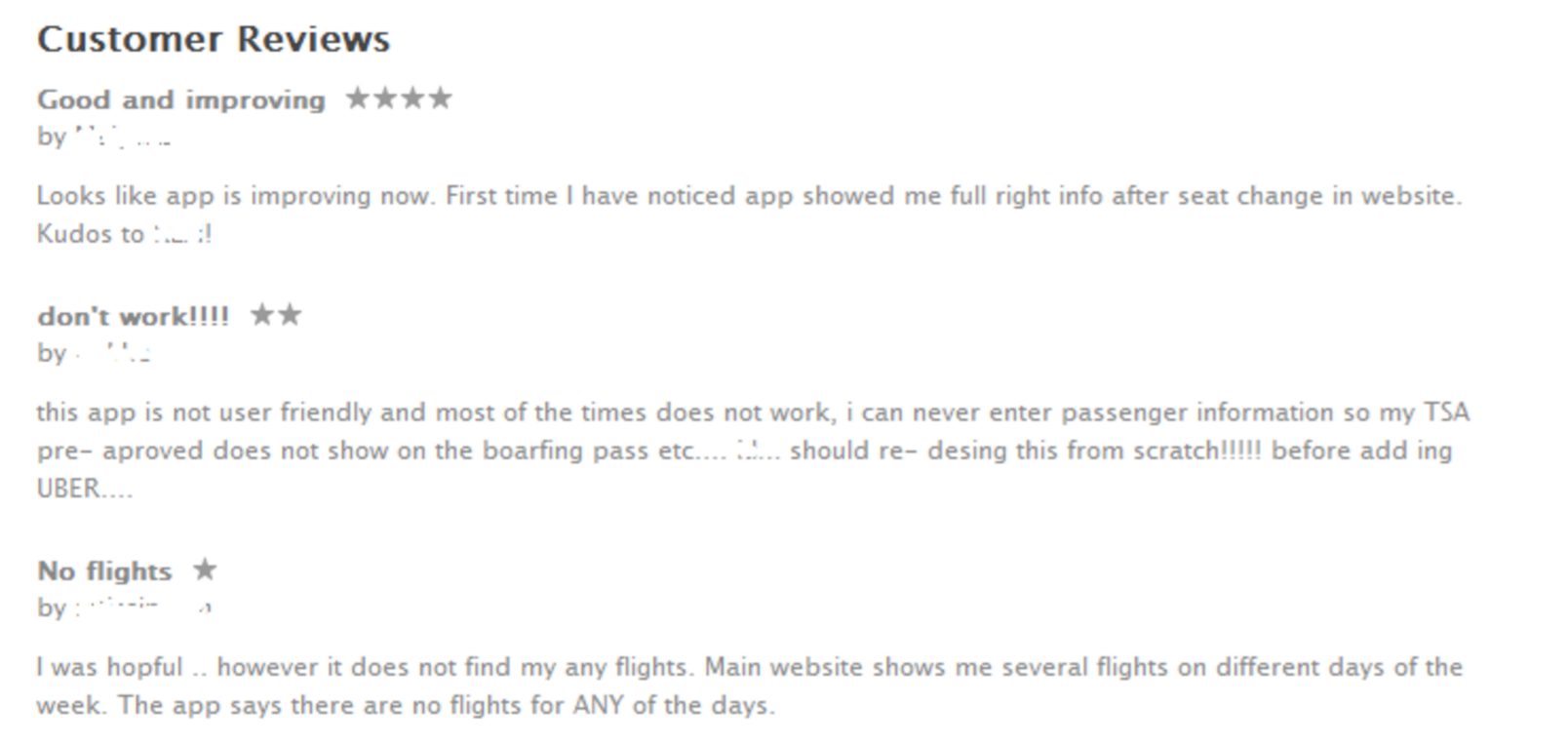
For example, consider the following reviews found on the iTunes Store of KLM’s app.

KLM app reviews from the iTunes store.
The first reviewer is happy with the latest changes, however her comment is not very specific. She mentions “right info after a seat change.” We can’t be sure if she’s referring to correct flight info or right personal data. Therefore we award +1 only to the “booking management” category, which includes references to seat changes. Similarly, we noted -1 in Personalisation, Booking, Check In, and Design, based on the reviews titled “don’t work!!!!” and “No flights.”
| Reviews | Personalization | Booking | Check In | Flight Info | Account | Compatibility | Performance | Design |
|---|---|---|---|---|---|---|---|---|
| Review 1 | 1 | |||||||
| Review 2 | -1 | -1 | -1 | |||||
| Review 3 | -1 |
It’s not always easy to find the right category to record user sentiments. To get a high level of accuracy, we have at least two analysts assess each set of reviews. The averaged scores allow for better precision.
4. Visualize & Analyze
Once the data is in the spreadsheet, we can summarize the results, and calculate and quantify key statistics. To make information easier to parse, it helps to present it in a graph. The graph represent at a glance the features that need to be improved, and where the app matches or exceeds expectations. If the analysis is extended to competitor apps, the graph can also identify features driving user satisfaction. This can serve as a source of inspiration for future upgrades.
I suggest using a two-dimensional matrix, with the “sentiment” score on the X axis, and the “frequency” with which the item was mentioned on the Y access.
To make the analysis more actionable, divide the plane into four quadrants, each aligning with a specific action. As a note, code for creating a graph like the ones our team designed can be found on the rpubs blog.
- Key Strengths: These are the features users loved, and mentioned frequently and positively. We should be proud of these features, maintain them, and promote them—as long as they also satisfy business objectives!
- Other Strengths: These are features that received positive sentiment, but with low frequency. It’s worth looking into the app’s analytics and to see how often the feature is used. If it’s underutilized, this is an opportunity to promote a great feature.
- Other Flaws: These items received negative sentiment, but only by a few. Take these reviews with a grain of salt—when users get the features they expect, they often call out a random feature and suggest it can be further improved.
- Key Flaws: These are the problem areas. If a feature falls under “Key Flaws,” that means almost everyone who wrote a review complained about it. Improvements should be implemented as soon as possible.
I encourage everyone to try it out, and contact me with your feedback. Who knows—I might graph the comments!
Analytics is more than just a numbers game. It's a way of tracking and analyzing user behavior over time. In this article, we explore this intersection of user experience and data, so that budding designers can add productive web analytics to their process.