In my 12+ years as a designer, I’ve worked in all types of situations. Some clients really have a handle on strategy and a tight focus, and others have tons of great ideas but it is more difficult to get to commit to a singular point of focus. In either case great design starts with a set of clearly defined parameters. The trouble is, how does one go from a ton of ideas to the perfect product?
Over the course of any design project, there are literally thousands of decisions being made, each of which can steer the project off course, or tighten the focus and keep it on target. The decision making process can often be 1) subjective based on the perspective of the team, and 2) tiring because of the variety of answers possible, all of which seem to make perfect sense, and have perfectly good arguments pro and con. The decision to add a browse capability to a geo-location map based application can be justified as either one too many features or a feature that can help the user do more with the app. The decision to add an option to create your own custom badge on a badge game may further complicate the game or make it more flexible to the user’s need.
If you take each of these choices and multiply it by 1,000, that equates to the decision load of the average project. This is where the real design is at: making accurate decisions based on our experience and understanding of human beings to help them accomplish a task, be it to read articles on a blog, to understand a company’s products and services, or to find out which car is right for me. We all have tasks we want to accomplish online, so how can designers make the correct decisions to “get it right”?
How do we make better design decisions to “get it right?”
In my experience, how all types of designers, marketers, and developers work is often intuitively based on their own experiences. How this works is a designer empathizes with the position of the person he is designing for and says, “If I were a [blank], what would I want to do here? What would I expect to see?” or maybe even “What would one shopping for [blank] need to make a purchase decision?” Most good designers operate from this perspective.
Other designers fly completely by the seat of their pants and just start designing, opening photoshop and “feeling it” intuitively based on things they’ve seen online, their connection with the client, or simply their internal comprehension of what is right for the job without putting any words to label it. The words or labels seem to erase the magic of what just makes it work for these designers. They just know it’s right…Or do they?
I’ve had the pleasure of working with some amazing people who operate from both perspectives. The problem arises in the presentation with the client who says, “I don’t like it” or “I don’t agree with your logic on how you arrived at [blank].” What do you do then? Some designers ask more questions like “So how do you see this working differently” or “Give me your feedback on [blank]” in order to refine the solution often reading between the lines of what is actually said, and translating it to the changes for the next comp. Some resort to straight up “salesmanship” and convince the client/team of their brilliance. Others just get straight out hostile because they feel like the client has not thought through the process, and does not “understand” the plight of the user.
As a person who designs websites, I have always and continue to believe that our reason for being is to be the voice of the user. Our job is to simplify things for those who use our products to give them value to make their life easier. I also believe that part of our social responsibility is for us to remove the clutter from their lives in order to get information they need as easily as possible. Much like a politician, our responsibility therefore requires we make accurate decisions on behalf of our constituents. We need to understand them on an intimate level, and make the choices they themselves would make, so when they work with the product, it does what they expected, and they are pleased.
The question now arises: As designers, how can we make accurate decisions—taking the subjective biases of our teams out of the equation—to create design that objectively meets the goals of the user?
While we will never fully remove subjectivity from the design process, there are ways that you can make better team decisions by doing exercises that create data and numbers by which the decisions become apparent, so there is no discussion about whose opinion is right. This removes the tension and debate that happens when 2 or more people on a team have perfectly valid arguments for a direction, but the project gets stalled because consensus must be reached prior to moving on. It can be tedious and tiring and can cause a project to lose momentum…fast.
However, when you start to quantify design with numbers, the truth appears before you in black and white, and helps you make the correct decision to move on. The more you can do this, the more fun you have on a project, and the more momentum you keep on a project (let’s face it, after 4 months on a project it starts to lose some of the initial excitement and luster it once had, becoming more work than labor of love).
The process
I recently attended a master class workshop with UX leaders Adaptive Path, and realized after 4 days of workshops the trick to their process was to create quick exercises that yielded quantifiable results as part of the exercise. Later on in the article, I will mention a few of these, but for now, what I noticed was that the decision making process was much easier, and we were quickly able to see results. From there, I incorporated their methodology into my own.
The resulting steps are:
- Create a unified focus
- Define the problem visually, in context
- Collect user data
- Create potential solution(s)
- Test and measure for accuracy
Creating a unified focus
When designing any product, the key is focus on the business problem. The challenge is that getting a group to focus is a lot harder than it sounds. Because of the many varying opinions, the clarity of the product often gets obstructed when working with groups. “Feature creep” happens in order to appease all the stakeholders involved. As a result, the product can lack a singular point of focus, is difficult to explain to consumers and even more difficult to use.
How to solve the problem
-
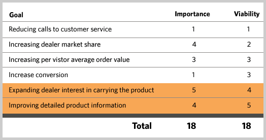
Get all ideas of opportunities on the table, rate them according to importance and viability. Gather all stakeholders from all disciplines in a room for one hour. Have everybody brainstorm business objectives of the site. You can write down the business objectives on a white board, and write 2 columns to the right of it each with the headers “Importance” and “Viability.” Rate each business opportunity on a scale of 1 to 5 for each attribute, however you cannot total more than an average of 3 point times the amount of items you have.

For example, let’s say you have 6 objectives, you would have 18 points for Importance and 18 points for Viability to distribute. Those with a viability and importance greater than 4 each must be part of the current initiative, 2.5 to 4 should be considered. Anything with a viability or importance less than 2.5 should be removed from the project. Document those principles and refer to them at every step as the gospel.
-
Agree on the design principles that will drive the project. These must be clear and understandable, and must be as specific as possible. For example, “Helpful at every point of the purchase decision,” or “As few features as possible,” or “Light-weight and fast loading.” If you can brainstorm and agree on those, it will make measuring design much easier once visuals are introduced into the project. Ideally 4-to-6 core design principles should be applied to any project.
Defining the problem in context visually
Another challenge with design is that people design in a vacuum. They design a product without any context of where and how it will be used. I have seen situations where we discuss a process of user flow that seems logical but once we made the steps concrete, we realized we were missing logic, or opportunities to improve the experience. The way to do this is by storyboarding and judging the accuracy of the storyboards to the initial focus.

How to solve the problem
-
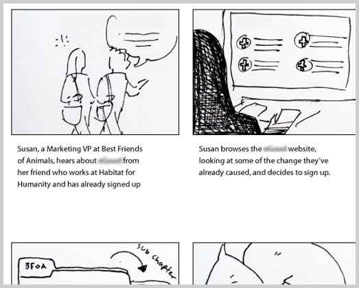
Take all the key user tasks and storyboard them out in their entirety. What you want to do here is illustrate 4-to-6 frames that show a complete transaction from a particular user perspective. For instance, if you have an e-commerce shop, you want to storyboard a purchase, a “browse,” a compare, and a return or support process. These are the key things your shopper needs. Think about what they need at each point. Also you will want to illustrate what happens on the business side. Does the order get printed out in the warehouse for a master pickup? How does accounting get the invoice? This helps create a real story and give life to diagrams and workflows that might not be realistic. Measure your diagrams against the storyboards for accuracy. If it is not accurate, revise until it is.
-
Create fictitious collateral for the product. What this involves is creating a marketing piece, a press release or a user manual to show what this product will do in context. The trick here is to create a document that is a creative tight presentation of the product, and it explains what the product does, how it does it and the customer value. Measure against the focus goals for accuracy.
Collecting user data
Much more than just analytics, true user data comes in 3 forms: interviews, surveys and clickstream. The grand triumvirate of those three tools give you a complete view of your user. User interviews are for seeing how people are doing things currently and observing patterns. Surveys are used for verifying hypotheses, and clickstream (your typical “analytics”) are for viewing current behavior. When you put the three together they comprise the angles you need for accurate data. Looking at clickstream data alone doesn’t give you the “why” behind the numbers. Interviews are limited by sample size, and surveys don’t give you much information on the “who.” The combination is powerful. While there is an art to doing all three of these things, as designers, it is not unreasonable to learn a basic set of chops on each of these to help inform your design and keep it on track.
How to solve the problem
-
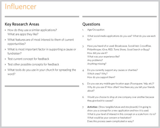
Talk to users. Most designers are used to some sort of segmentation and/or persona development on a project. This is the act of creating a story and lifestyle around a user group or market segment to make it easier to visualize. The goal of this is to get a picture of your users. In short words, find some of these people and get them on the phone and ask them a lot of questions. There are varying degrees of research ranging from full in-home visits to casual chats. It’s not the degree so much that you do it. Do it to gain understanding, do it to get better empathy, do it to gather data, but just do it. It is beyond the scope of this article to get into the particulars of it, but my words of wisdom are:
- See if you can get your clients involved in recruitment.
- See if you have any friends who are in the target market.
- Try to create non biased questions that do not lead the participant in one direction or the other.
- Be prepared for some participants to be flakey, difficult or reticent.
- Take notes during the interview (if off site only!), and post all the “insights” from each interview on a post it note. Group all the post it notes in like groups, and see what comes out. Often the answers will be right there on the wall.
-
Look at the analytics You should not be afraid to look at analytics.They will tell you about your users: what they are looking for, what pages they find interesting, where they left the site, how long they are on the site, and most importantly, places to benchmark things like bounce rate, time on site and conversion rate. If you are unfamiliar to analytics reports, start with the basics then drill down. The following are basic benchmark info and their “averages”: Bounce rate (30-50 per cent), conversion rate (2 per cent), time on site (2-3 mins), search terms, browser/platform/bandwidth stats and possibly location data. If these are worse than these averages, try and find out why, and what you think can be done to fix it. If you can point to the numbers for where you got your postulate, you’re on the right track.
- Review survey data. Ideally this will occur after you have had the opportunity to get both the first 2 items done, but some surveys on their own can yield some insight as well if done correctly. You can view questions like “rate the service from 1 to 10″ as a good way to benchmark service. There often brand related questions like “What word comes to your mind when you think of [blank]?” and these are good for judging how creative is going. In general, I like to contribute to the questions and let the marketing team know what we want to get verification on. Our interviews are often too small of a sample size to verify the opinions of everybody, so ideally this is a great place to ask people to verify your theories using “yes or no” questions, as well as ratings from 1 to 10.

Creating potential solutions
After collecting data, defining and focusing on the business problem, now it’s time to come up with some ideas and compare them to a standard. With focus, you defined a goal. By creating storyboards, you visualized the goal, and with the data, you have some reality to base your ideas. Now it’s time to create! Yay! When creating solutions, it is important to remember that you are not only measuring this against your own professional standards, but on a scale of 1 to 10, how well does this fit the defined criteria.
How to solve the problem
- Review against the focus. This is the singular place to be ruthless in your judgement. Does this address the business need? Your solution should incorporate some research to back up the “how” you arrived, but number one is that it has to be judged against the focus that everyone agreed on. If there are any subjective “aesthetic” questions that arise out of this conversation, address those separately, but you should be able to go page by page and rate on a scale from 1 to 10 on how close you adhered to the design principles and the focus. Anything less than an 8 must be revised.
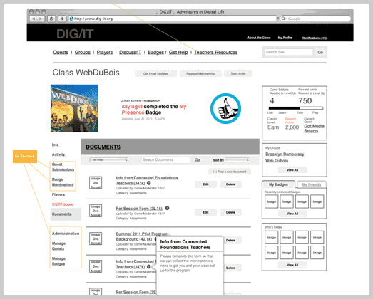
- Review against the storyboards. Based on the research of what is acceptable to users, does this match up with the vision of the storyboard. Are there additional steps that need to be visualized?
Testing and measurement for accuracy
So you’ve completed a design that the whole team can get behind. You’ve evaluated against business goals, and the solution lines up with design principles and research. Congratulations, you’ve made it! First at this point, go grab a beer, because you have probably done an amazing job and should celebrate with your team…then you send it out for testing. Testing can come in different forms. Mainly we’re going to discuss usability and concept verification. These are used to make minor refinements and verify that you have indeed done your job right. The good news is that if you have been adhering to a data focused approach to design, you should be most of the way there. There should be very few big surprises. You’ve made smart decisions along the way. Now, you fine tune.
How to solve the problem
- Concept testing. If you can get your concept in front of some people in your target demographic in a tight wireframe format, do it. If not, you can concept test after you have full visuals for both emotional connection and concept preference. You can use a service like usabilla for this, which asks users to click on flat artwork to show what they like, or where they would initially click. You can also use Skype and do an interview (which is best, but you may have a limited amount of participants so this may not be possible) and show the participant the concept through screen share.
- Usability testing. This may range from full-on usability lab work to a screen share through GoToMeeting. The big challenge with this is the participants. You may have used up your participant cards in the previous exercises, so you may be stuck with a remote video testing company like User Testing.com. What you will want to do is take those tasks defined in the storyboards and see how well the end product performs against that. Is it as easy? Easier? What is the feedback? Do you see people using the back button? If people are doing what you wanted them to do, great, you’re successful! If not, see where the hangups are and propose solutions to refine.

A few closing words
The closer you can get to quantifiable design, the easier and better design becomes. The trick is to compare something with something else. You really should steer design discussions from “I don’t like it” to “Does this match our goal.” If it does, then does the goal and values of the team need re-evaluation and discussion. That is where the beauty of a meeting can occur: the brainstorming and agreement of principles and ideas. Once you have all agreed then it will be a group effort, and you can get support from all team members. Plus, there is no greater feeling than to work on a project with full confidence that the solution you are creating will meet the needs of your user. Not because of your own opinion, but because it matches up with a quantifiable result.
One last word of advice…document and prepare visuals to support at every turn. In our firm we learned early on that the way to win the subjectivity war, was to document all of our thoughts and prepare visuals that create insight for the whole team. We realized that often in the game participants are not even in the room, and are judging the work on the subjective game. Clear documentation takes extra time, but helps you clarify your thoughts, and helps everybody understand how the decisions were made, and if someone new jumps onto the project mid stream, you can hand them the documentation, and get them easily up to speed.
Analytics is more than just a numbers game. It's a way of tracking and analyzing user behavior over time. In this article, we explore this intersection of user experience and data, so that budding designers can add productive web analytics to their process.