Sophia used analytics to help identify what to usability test for her client. So far though, Sophia has only identified individual pages and sections of the site; she feels she needs to know more about the most common user journeys. She’s also concerned about deeply understanding her users, and wants to see how different types of users interact with the site. To run the best possible usability test, Sophia really wants to get a clearer picture of how people are actually using the website.
In short, analytics work as an excellent method for identifying the best areas of a site to usability test. In Part One of this article I covered how to use analytics to identify problem areas on a website. Doing this gives us a better understanding of current user behavior, and helps focus in on the tasks we’ll test.
In the concluding part of this two-part series on using analytics to guide usability testing, I’ll look in more detail at identifying user journeys and segmenting users to compare the behavior of different user groups.
Identify drop-off points
Knowing how users move through a website can add context to single page stats. For example, analyzing previous pages on a user journey may help to indicate why the exit rate of a particular page is so high. In addition, finding out the common user journeys through a website can be very beneficial when it comes to creating usability tests. Usability test tasks can be created to mirror those common user journeys, ensuring that the behavior of users during tests is inline with that of existing site users.
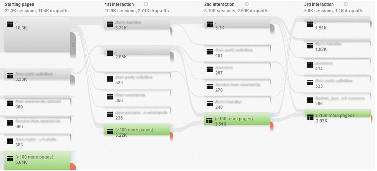
Google Analytics attempts to show user journeys with the user flow and behavior flow reports. These can be hard to read, and often suffer from grouping multiple pages together, meaning that Google Analytics will often only show the top few most popular pages individually but will then combine several pages and label them as “>100 pages”, which is of no help at all. The screenshot below shows how only a few individual pages are displayed for each step of journey before pages are grouped, making analysis difficult due to this limited information.

Despite the issues caused by page grouping, spending time analyzing these reports can identify problem areas based on drop-off rates or unexpected user journeys (i.e. did a user go in a very different direction than we expected?). Once we identify the problem areas, we can create usability tasks to see how users a thinking as they go through the journey, and learn why they’re having trouble.
In Google Analytics’ user flow and behavior flow reports, pages are visualized as green boxes with grey lines showing the user journeys between them. Each box also shows the percentage of ‘drop-offs’, in red, where users are leaving the site. They can help demonstrate popular user journeys and where users are exiting the site, which is another indication of problem areas.
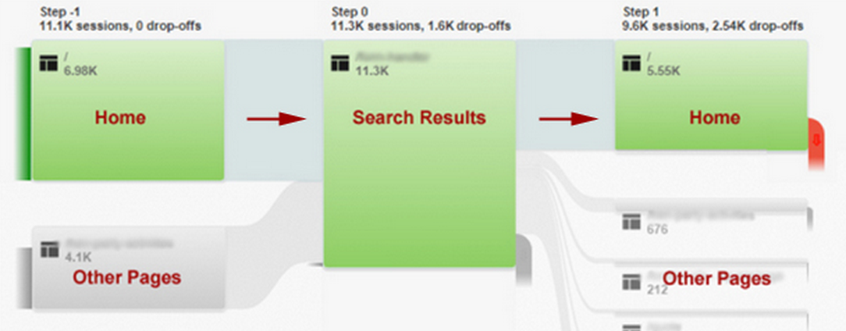
The example below comes from a travel site that I worked on which featured a prominent search box on the homepage.

In this annotated and simplified picture, we can see a potential issue. Visitors were using the search box to find a holiday destination, but then returning back to the home page from the search results page (aka pogo sticking), demonstrating that the search results shown were unsatisfactory in some way. This could be due to a number of reasons: perhaps the search was regularly returning no results, too many results, or too few results. It could be that the problem was not with the search results themselves but another factor such as the prices for the holidays shown on the search results were too high.
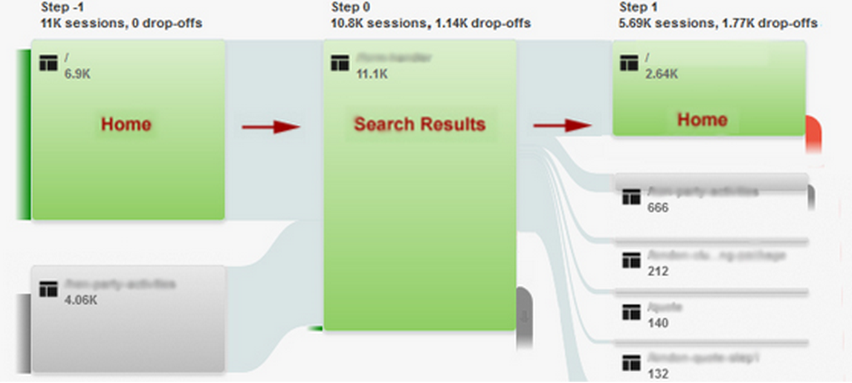
The fact that the data suggested that the initial search was unsatisfactory led me to run some usability testing on the search box. The usability testing uncovered that the problem was actually that the search results were too broad, and users were overwhelmed by the number of results. Based on the outcomes of the user testing, I suggested introducing a faceted search system on the results page allowing users to filter results on a range of criteria without having to start their search again from the homepage. The new search system allowed users to filter their results on facilities offered; such as whether the hotels in the results had swimming pools, gyms and other facilities, which in turn meant that they were able to find results that were useful to them. The design solution led to a large reduction in the number of users returning to the homepage after their initial search, and saw more users reaching the next step of their journey.

The screenshot above shows the analytics for the month after faceted search was introduced; showing a reduction in ‘pogo-sticking’ between the homepage and search results. While there is clearly still room for improvement here, it was encouraging to see positive results from the change.
Segment data for greater detail
Segments offer a great way to look at the differences in behavior across different types of users. One simple example would be comparing new and returning users. The graph below shows that, in this example taken from an online jobs board, the number of visits from new users remained fairly consistent across the month. The visits from returning users followed a different pattern though, with clear dips in traffic around the weekends.

This led me to look in more detail at the differences between new and returning visitors. Looking at other metrics for these two groups showed that returning users tended to spend longer on the site, look at more pages per session and were more likely to apply for jobs.
From this data I was able to hypothesise that returning visitors were more likely to be serious job seekers, while new users were more casual in their approach. This led to me recommending some personalisation for the site. My recommendation was that new users should be shown reassurance that the jobs board was a legitimate and trustworthy place to search for jobs and be directed towards quick/simple calls to action, such as signing up for job alerts. I also recommended that returning visitors were shown more sophisticated and detailed job search options, and messaging to encourage them to apply.
The ability to see how new and returning visitors behave differently can demonstrate many things, depending on the type of site. It can show, for example, that people returning to an ecommerce site are more likely to convert. If this is the case, it may be worth focusing on helping convert additional users on their first visit.
The analysis of this type of segmentation could also play a part in recruitment for usability testing. If there are clear differences in the behavior of new and returning visitors then it may be advisable to test with both existing users and those who have not used the site before. Testing with these different user types may help explain why they are behaving differently on a site.
There are several pre-prepared segments in Google Analytics to help slice up the data, beyond the new and returning users example shown above. These include:
- Different traffic sources—useful for identifying how visitors who found the site via search differ from those who came via links on other websites.
- Visitors using different device types—useful for comparing the metrics of mobile, tablet and desktop users.
It is also often a good idea to create custom segments, so that the segments closely match the key audiences and persona types across a website. In this way, we can analyze the different user journeys that these groups take through the site, such as comparing existing customers’ journeys to first-time purchasers.

Segments can be used to view the user journeys of people using different device types. Segmenting by mobile, desktop and tablet will give three different behavior flows to investigate. This can be particularly useful when it comes to identifying potential problem areas for these different device type users. The behavior flow diagram for mobile users may see a big drop-off point during the user journey, which is not an issue for desktop or tablet. This should lead on to mobile usability testing, focusing on those problem areas to find out why mobile users are dropping out of the journey at this point.
Now What?
The next step after using analytics to identify the problems is to find out why users are having those problems. Looking at analytics provides some key areas to focus usability testing or split testing on. As UX professionals we naturally want to spend time with our users, learning from them through usability testing. Analytics simply help guide our way to better tests.
Try it – take some of the techniques outlined here and try applying them to a specific project. It’s surprising how much we can discover through analytics.
For readers still feeling uncertain, there’s plenty of help available. To keep up-to-date with the latest developments in Google analytics I recommend the official Google Analytics blog and Occam’s Razor; the blog of analytics guru Avinash Kaushik. A practical way to improve analytics know-how is to check out the Google Analytics training centre. These tutorials are also excellent preparation for gaining a Google Analytics Individual Qualification.