Usability research on single-intent website pages can feel daunting. How do we measure success with test users? How do we know we’re testing the right element? Where do we find users to test?
A single-intent landing page contains one form or a single CTA, often with a request for a user’s personal information in exchange for something. These pages can appear as part of a marketing or social campaign, can be a PPC target, or can be a single page of the website where a big ask is made of the user.
Once the basics of landing page psychology and best practices have been ironed out, usability testing is the best approach to improving the landing page experience as well as the results.
Understand How We Make Decisions
A landing page works when it contains all the elements to trigger a decision. The human decision-making process is backwards from what one might expect: we choose based on instinct or emotion and later assign logic and reason to the choices we make. Good landing pages tap into powerful emotions — joy, relief, desire, fear — and offer a clear solution. The user may not be aware they need something until they reach the landing page, but the need and the solution should both be clearly painted when they arrive.
One of my favorite resources for strong usability questions is David Travis’s talk on the 7 Deadly Sins of User Research. Travis understands the way people make decisions, and he talks about downfalls we as researchers face. A vital sin in landing page optimization is credulity — or asking users what they want (or which they prefer) and believing their answers. In an emotions-first, logic-later decision, a user can’t tell you what they want. I love Malcolm Gladwell’s Spaghetti Sauce talk to illustrate this point: he says if he asked a room full of people what kind of coffee they liked, they’d all say “a rich, dark, hearty roast”. But left to a coffee bar and their own devices, most people make milky, sugary coffee for themselves.
Know the Goals of the Page
Goals on a website are always two-fold: tasks or needs a user hopes to satisfy plus metrics the business hopes to satisfy. If either side of this equation is not held in balance to the other, the page won’t work well. Users can sniff out when a company is more interested in profits than customer satisfaction.
Begin by clearly establishing users’ goals for the landing page and the business goals. Ideally, because a landing page or lead form is so hyper-targeted, there will be only one goal for each.
Users: get the thing.
Business: give the thing.
When we get back to the heart of the page — the people using it — we begin to ask the right questions.
Look at the Data
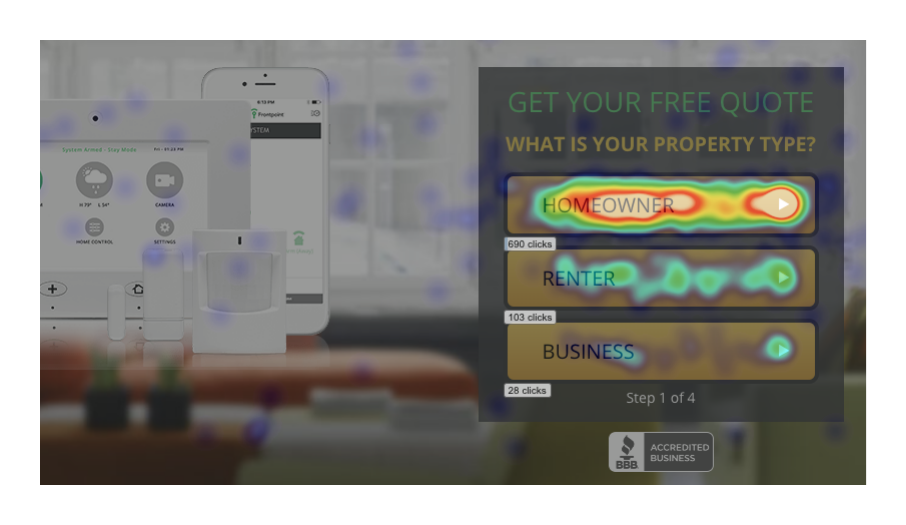
On single-intent landing pages, traditional usability tools often don’t tell the whole story. Heatmaps can be encouraging — there are hundreds of clicks to the form and the button! But do these results align with the conversion metrics? Begin with due diligence into analytics and reporting to understand as much of the page’s story as possible before deciding where or how to optimize.

Heatmaps of a lead form, showing lots of clicking.
With help from Google Analytics, compare the volume of traffic the landing page receives to the number of conversions from that landing page. Identify traffic sources and highlight, if you can, the ones that convert best. GA offers basic demographic information, but slice the data through demographic filters and see if any trends stand out. GA certifications aren’t required for this kind of work – there are loads of YouTube videos and articles that can help a researcher hone in on clear trends around a landing page.
Landing Page and Lead Form Best Practices
The first place to start is landing page basics. In the strategy, design, development, and client approval process, some best practices can be left out or overlooked. Consider these low-hanging fruit. Once the landing page is as good as it can get based on expert knowledge and best practices, then start the usability testing to optimize further.
Unbounce’s landing page optimization crash course is easy to read through (optimized!). Oli and his team have been building converting landing pages for a decade and if anyone knows best practices, it’s them. In fact, just running through this 50-point landing page checklist should point any team immediately in the right direction.
For lead form optimization projects, consider similar resources on the ideal lead form design before starting usability research. UX Booth offers insight into the rules of form design and designing forms with accessibility needs in mind (there’s a very real chance users can’t convert because they can’t complete the form).

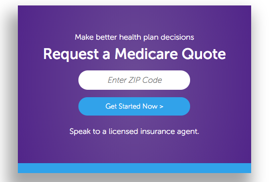
A super-simple lead form, but for an audience that may have accessibility issues.
Forms differ from full landing pages in that they require a series of actions. To suss out action-based insights, don’t ask top-level questions like “Where would you click to submit the form?” Think one or two steps beyond what is presented in the test and ask users how they would go about getting to the third step, based on what they can see in front of them.
A key tip to remember when testing is to keep the load on the user light. Don’t ask them “What’s wrong with this design?” or “How would you fix this design?” That’s lazy testing and puts maximum effort on the user. Keep questions action-based and directed. Rather than asking “What’s most frustrating about this form?” ask “Are the labels on the fields clear enough – do you know what each of them means?” User experience and user testing teams often have a pretty good gut feel on what piece of the design is working. Testing helps confirm, deny, or clarify that piece.
Remote Usability Testing
Remote usability software is getting better and better by the week. Yet, it’s still not good enough to just plug-and-play without some consideration of what questions to ask and what results are expected.
Remote usability testing offers preference tests (i.e. Which of these two things do you prefer?). But UX testers don’t ask this question because we know users will answer emotionally and assign logic backwards to their choices. Instead, testers develop questions that will get users to explain their thinking rather than make a choice based on emotion.
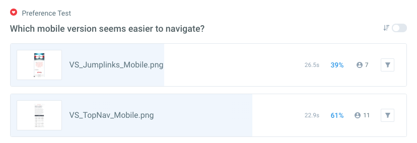
Rather than asking which version people prefer, think instead about the context they’ll be using the design in and the needs the design was built to meet. Ask questions like, “In which version is editing your account settings most clear?” or “Which design helps you best understand what will happen when you click Submit?” These types of questions reduce credulity on the analyst’s side. They also improve users’ ability to interpret what is most important in the test and not get bogged down in minutia.

A test asking about functionality, not feelings.
Lead form testing follows a similar mindset to landing page testing. Rather than asking what action the user might take on a lead form, ask if the page is compelling enough for them to complete the lead form. Ask which fields in the form are too personal, if the number of fields feels high or low, and what they believe will happen when they submit the form.
With preference testing, be sure to make the differences in versions clear. If the design difference isn’t dramatic or the test is based around a small element, call attention to those pieces in the setup questions. I’ve seen countless tests where a question is asked on the premise that users will see a small detail, and the answers received are always vague or unhelpful. If the variation designs aren’t different enough, there’s little point in testing.
Be clear in the context offered to remote testers. Consider the device they are on and how much screen they need to understand clearly what is being asked of them. In a copy or icon-based test, the words and images matter most, so it’s fine to show users just the two variations. In a button test, they probably need the button variations and just enough of the screen to give context to the buttons. Showing testers two entire pages full of copy, buttons, and icons, and hoping they’ll pick out the details is unfair and taxing, especially for a remote tester.
Task-Based Usability Testing
Task-based testing is excellent on single-intent landing pages. Every heatmap software worth its salt should be able to produce a recording of a user trying to accomplish the main task on the page. The active observation of a person executing a task can not only be insightful into what’s not working on the page but also compelling evidence to the rest of the team about what needs to be fixed.
Gerry McGovern’s top task testing method is great, but observing live users can sometimes be hard to arrange. Teammates who have never seen the website, family members or friends who fit the target demographic, or compensated volunteers from Craigslist can all help give insight into sticking points on the page or form.
Center landing page test goals around things you can measure or change. This can include time on page, number of fields completed, time to task completion, or even further down the funnel, the leads coming in aren’t converting — users fill out the form, but something on the second half of the experience doesn’t match their expectations and they’re reluctant to buy after all.
Try, Try Again
As Dan Ariely points out in his book, Predictably Irrational, the people on the other side of the screen that are using a website are emotional, reactive, and illogical. But there are patterns to their behavior. An optimized landing page acts on those predictable patterns to both meet the users’ needs and reach the business’s goals. If the first round of usability testing doesn’t come out like the team had hoped, don’t give up. Review David Travis’s 7 Deadly Sins and Gerry McGovern’s task-based question list. Usability testing is a honed skill — we all iterate and learn as we go, both from the experts around us and the results right in front of us.
Analytics is more than just a numbers game. It's a way of tracking and analyzing user behavior over time. In this article, we explore this intersection of user experience and data, so that budding designers can add productive web analytics to their process.