It’s easy, in a company that sells tangible services or products, to report on ROI: the formula goes something like “gross profit minus marketing costs equals return on investment”. But as a content strategist, when I was asked to provide some form of ROI for the work I was doing, I ran into a wall. How do I prove a return for an uneven exchange: my knowledge and information versus a user’s time?
Most of the content industry will say content strategists shouldn’t be responsible for return on investment, but I have a hard time believing that. I get a paycheck and spend eight hours a day at a desk—why shouldn’t I try to convey how much money my time and efforts bring to the table? In whatever form it takes (dollars, influence, reach), my return is as valuable and worth quantifying as each of the other channels in my industry.
In this article, I’ll review the types of ROI a content strategist can provide to their direct reports, the metrics I look at to create an ROI report, and resources for fine-tuning those metrics to improve measurement on any website.
Do You Speak C-Level?
The first, most important part of measuring ROI is knowing what to measure. Clearlink, the company I work for, is a data-heavy, analytics-minded content marketing company, and our Executive Vice President of Marketing is an SEO specialist at heart. I know that translates to dollars and leads earned in my reports.
But not all C-level execs care about money as a success signal. The director of a non-profit, for instance, might care about influence, or brand awareness, or volunteer sign ups. The CEO of an education software company (while she’d like to sell software) is also concerned with buy in, understanding about how the tool functions, and making sure educators know how the tool meets their needs. The owner of a social media platform may only find reach and brand awareness as valuable metrics.
The first step before measuring is learning what metrics to measure. Measure in the language the C-levels speak, and that’s one less revision to a monthly ROI report. By choosing metrics that resonate with the C-level and ensuring your ROI reports make sense to them, you are reducing friction and framing yourself as empathetic and proactive. In a C-level’s eyes, that’s also one more person who clearly understands and pursues the company’s core goals, which will speak volumes for the content team. So let’s explore what kind of language a content strategist can use to communicate ROI to their team and management.
Breaking Down The Metrics
In most kinds of data analysis, there are soft metrics and hard metrics. Soft metrics are generally easy to collect and analyze, especially on social media assets. Hard metrics are found through measuring tools, like Google Analytics, and statistical significance. For content strategists, the value (the ROI) lies in connecting soft metrics to hard ones. The examples below are how I tie soft social or user-submitted metrics to hard data-driven metrics in order to produce a value for the return on my content pieces.
Direct and Indirect Feedback
Direct feedback is given voluntarily and explicitly. This comes in the form of comments, private messages, product reviews, forum posts, tweets about a brand or product, Quora questions or answers, and so on. It also includes questionnaires, surveys, rating forms, and requests for feedback.
More often, users give feedback indirectly, or without realizing it will be visible to a brand. This includes pins, page or post likes, shares, recommendations in forum posts, peer to peer tweets that are not solicited or sponsored by the brand, and purchases. But users most frequently tell brands their preferences via dollars spent.
In hard metrics, user feedback reveals itself as clicks, calls, submissions—any goal completion established on the page. These can range from an email address or zip code submission to a completed purchase. These metrics are fairly straightforward for showing ROI: take the total number of conversions in a timeframe (week or month is best) and convert that to dollars earned for the company. Then subtract marketing costs for that same timeframe. There are a couple of formulas to return ROI without marketing or overhead costs included. Remember what language the C-level and stakeholders speak, and choose the formula that works best for them.
Behavior Flow and Conversions
User feedback can also be evaluated through funnel tracking, in Google Analytics. This tool shows not only which page a user came in on, but also which pages they visited afterwards and which page they exited from.
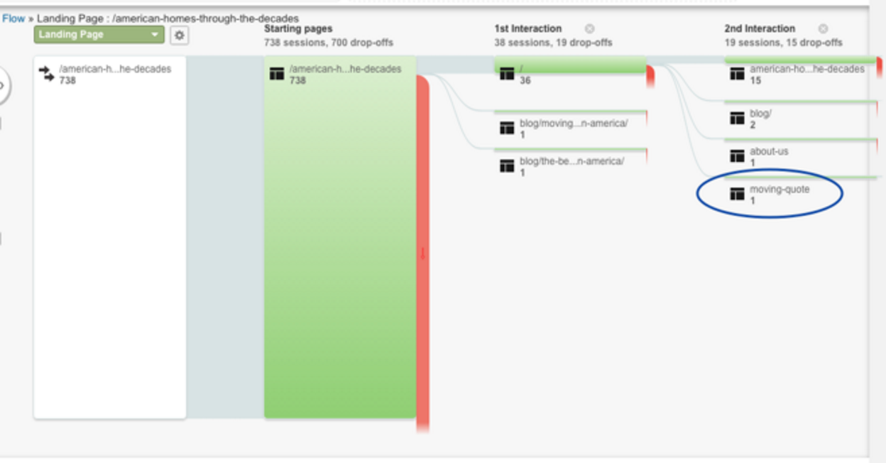
On my site, I know many users come through the “American Homes Through the Decades” page. However, that page does very little for the core site goals – it just pulls in traffic. Ideally, every visitor to my site would go to the “free moving quote” form and complete it. So I need to find out if any of the traffic to American Homes is converting. In the Behavior Flow view in Google Analytics, I can choose the segment of traffic I want to view and how I filter the results. Because my outreach team spent time and effort on increasing traffic to this page, the Referral traffic segment is most valuable to me, in combination with a Landing Pages filter, which shows American Homes’ relative value compared to vital pages like the homepage and quote form.
In one month, American Homes received 738 referred visits. I also see that 700 of the visitors dropped off at the American Homes page, but one intrepid user made it through several pages to the moving quote form fill.

Now comes the creative thinking: I know that for every person that fills out the moving quote form, I make zero dollars. But I get the opportunity to remarket to them, which adds up to 15 emails in front of their eyes. We get an average 37.4% open rate on the first two follow-up emails – from there, open rates drop dramatically, which tells me the first two emails are the most valuable. And each email that goes out holds a minimum of two calls to purchase one of the products we sell. The minimum sale from one of these purchases yields the company about $56.
So working backward, 738 pairs of eyeballs yielded 1 opportunity for remarketing (or approximately $56). So if 1 in 700 people could yield $56 monthly, then I need to find a way to increase traffic to that page or reevaluate why we’re spending so much time pushing traffic to a low converting page. If I decided to push traffic, I’d report a goal that read along these lines:
“1 in 700 people to the ‘American Homes’ page converts, so to increase the chance of conversion, we need to triple or quadruple the monthly traffic to that page. If we reach a goal of quadruple traffic, we stand to make about $225.00 a month from that page alone.”
Heat mapping and attention tracking
Paired with analytics data like time on page, event tracking, and exit pages, attention software can give an idea of why users are or are not interacting with a page.
For instance, I led a homepage redesign that added three clear steps below the hero image, explaining how the site works for consumers. Our design team created neat little icons to illustrate each step of the process: “Enter Your Zip,” “Choose a Package,” and “Give Us a Call.”
The goal on the page was to encourage users to enter their zip code through a field in the hero image, and I expected the directional steps to increase entries. But after a few weeks, there was no change in zip submissions. Google Analytics showed we were still getting the same amount of traffic to the page as before the redesign, so I turned to heatmaps to try and understand why.
We found that instead of clicking on the zip submit in the hero, users were clicking one of the three instructional icons, “Enter Your Zip.” Without heatmaps, I never would have known people were misunderstanding the directional icons. I then had to evaluate what the user expected from clicking that icon and why they preferred the image to the CTA in the hero.
I know that one user through the zip finder who purchases is an average $48 yield for the company. In this case, we already knew the monthly ROI of the zip form without instructions, so we were interested in the ROI with the instructional icons. With heatmaps, we were able to identify a hole where potential conversions were falling out of the behavior flow. And by creating a simple fix, we could regain about ten percent of the conversion-ready traffic that was being misdirected.
In this case, my report to my manager would recap the leak we identified, how we planned to fix it, and an estimated dollar figure on the expected increase in ROI through that particular zip code form.
Bounce rates and time on page
I use these metrics largely as a guideline for pages that need work. If my traffic numbers are up, and I’m seeing a lot of direct or referral traffic to a specific page, but users aren’t staying long, the page may not be meeting their needs.
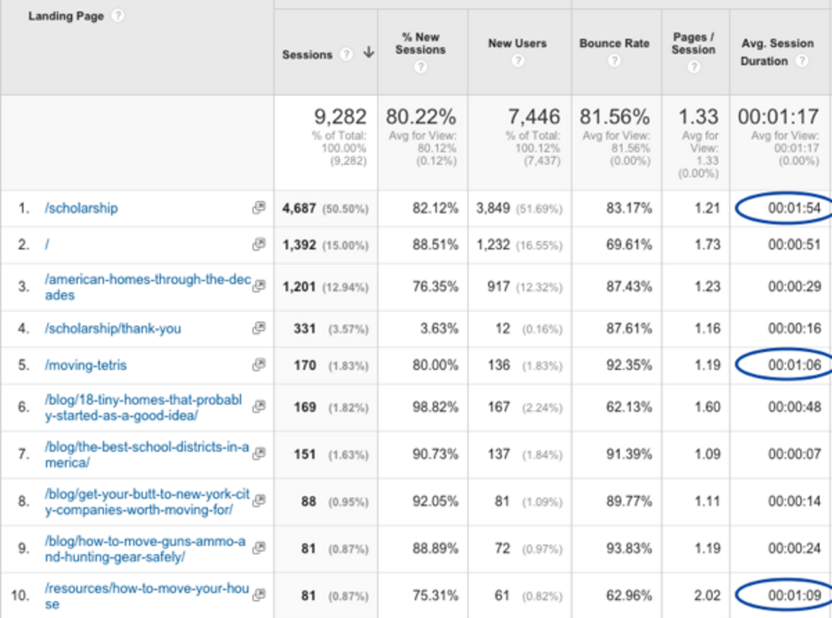
For instance, I expected most users to our site to visit our scholarship page and several of our more in-depth resources — all of which have form fills or interactive elements that should be highly engaging. Google Analytics showed me users are doing just that, spending the most time on the pages I want them to visit:

However, there is also a form fill on the homepage (designated as “/” in the above table), and the time on page does not suggest users are entering the form. My next steps will be to implement heat tracking and reexamine the customer journey to determine if I’ve misunderstood users’ needs on the homepage.
We currently report ROI on the homepage form fill by completions, not dollars. In my report to management, I would compare our current completions (about 12 a month) to our current traffic numbers (about 1400 a month), outline the steps I’m going to take to improve form fills, and estimate what percent of the current traffic we could encourage to sign up for a free quote.
Bonus Metric: Link Clicks
This tiny metric in Facebook and Twitter is easy to overlook, but it can be very valuable. For each piece of content posted, Facebook and Twitter track link clicks. And link clicks can be tracked through a website in Google Analytics’ behavior flow tool.
I compared two posts: each linking to a unique page on our website, one without promotion, and one with $100.00 promotion budget.
After a week of traffic, Facebook’s Insights reported 0 link clicks for the unpromoted post, and thirty for the promoted post. When I cross-referenced my traffic in GA under Source/Medium, all thirty referrals from Facebook were counted for.
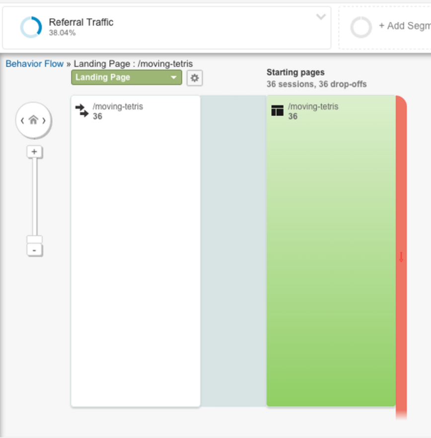
But I don’t care about referrals – I want to know if Facebook traffic leads to form fills. Going back to the Behavior Flow tool, I could see that all referral traffic to the promoted link I shared on Facebook dropped off immediately. No one converted.

In this case, no conversions are fine – we don’t tend to expect them from social media. But this is a good metric to keep an eye on. If I’m posting content to Facebook that I hope converts, the behavior flow tool combined with a few landing page stats will help me see if I’m getting close. And if I’m boosting or paying to promote posts, I immediately have a dollar figure to correlate to traffic and conversions.
Next Steps for ROI on Content Pieces
As companies better understand the value content strategists bring to their processes, it can’t hurt content strategists to have an ROI-based strategy in their back pockets.
First, meet with stakeholders—whether they’re C-level or a direct report – to determine the metrics they value. To stay a step ahead, think strategically through their eyes and have metric suggestions, next steps, and a strategy draft in place when you meet.
Second, identify your goals for each page on the site—traffic, conversions, clicks, email submissions – and outline the key things to measure for on those pages. Then set up a Google Analytics report to reflect those metrics: create custom segments, save reports to pull automatically, and create a report template that will pull all this data together in a meaningful way for higher ups.
Third, identify areas where the organization’s goals are not being met, ways to improve them, ways to measure the changes, and ideal numbers to aim for post-improvements. This may require more software like Optimizely or a program like Unbounce’s, and help from a CRO or testing team. But be proactive in identifying leaks or holes in page strategies and ways to try and improve ROI in those areas.
Fourth, and possibly hardest, is tooting your own horn. Whether management requires reports or not, supply reports. Be consistent, be timely, be proactive, and don’t be afraid to tell people about what you’re doing. By tying ROI to content production, content strategists create a tangible way for the company to talk about content’s value add.
Analytics is more than just a numbers game. It's a way of tracking and analyzing user behavior over time. In this article, we explore this intersection of user experience and data, so that budding designers can add productive web analytics to their process.