Interacting with apps and websites can sometimes be frustrating. Have you ever encountered a link, button, or image that just won’t respond the way you want it to, no matter how many times you click or tap? If so, you’ll understand the concept of rage clicking.
Rage clicks happen when users repeatedly click or tap in irritation on a particular element or area in a concentrated space of time. As users, we expect digital interfaces to respond to our actions in certain ways. When they don’t meet our expectations, we naturally feel annoyed. Rage clicking, and other forms of computer rage, are a physical manifestation of this feeling.
What do rage clicks signify?
Typically, if there’s a lot of rage clicking on a website, app, or another user interface, it’s a sign that something could be going wrong in the user experience. Possible causes include:
Misleading text or UI elements
Over the years, certain UI design choices have become more and more common. Some have reached the point of becoming established design conventions. Veering too far away from these conventions can cause confusion for users, who have become used to things working in a certain way. For example, underlined text is generally understood as a link, so users are likely to try clicking on it. Underlined text that leads nowhere could result in a mismatch between the user’s experience and expectations, triggering a rage click.
Slow responses and a lack of feedback
If your user clicks or taps an element and doesn’t receive feedback quickly, they may click repeatedly to confirm that the click actually worked. In these cases, users need to see a proper loading message or some other visual indicator. This will help them feel reassured that their action had an effect.
Errors, dead links, and broken elements
If a usually-interactive element becomes non-responsive users are likely to respond with annoyance. It’s important to ensure that the elements and links are up to date and functional.
Unclear headings or confusing navigation
Users want important content to be discoverable. They want to feel confident about what they’ll find when they click on a heading or a section on a navigation bar. Navigation should be as clear and unambiguous as possible, with a taxonomy that matches the user’s expectations. Vague navigation categories and unclear taxonomy could result in a rage-clicking danger zone.
Rage clicking is particularly likely to happen when the user is unable to see another way to reach their goal on the interface. If clicking doesn’t work, what are they supposed to do next? In these cases, you may need to make some UI adjustments to steer your users towards their goals in a more obvious way.
How Can You Identify When This is Happening?
You can observe how users are interacting with your site by using tools such as Hotjar’s user session recordings. They allow you to track movements like clicks, taps, and scrolls, revealing how users are interacting with your website. Some tools even have dedicated rage click detection features to help you identify this specific action.
A Hotjar session recording, showing how the user is moving across the page and where they have clicked.
What appears to be rage-clicking at first glance might not always be down to a user experience issue. It’s important to pay attention to context when you notice a clicking hotspot. In some cases, people will click repeatedly out of habit while reading or scanning a page. It doesn’t necessarily mean they’re frustrated or angry.
However, if you notice repetitive clicking consistently on certain elements or areas, and it’s coming from several different users, it’s time to take a deeper dive and identify the causes.
Some elements may invite repeated click events, such as zoom or volume buttons. In cases like this, repetitive clicks may not signify frustration, but simply users interacting with the page. It could be worthwhile to review these elements anyway to try and find a more efficient way for users to complete their task.
How We Turned Rage Clicks into Actions
Here at Cyber-Duck, we were able to use rage clicking as a signpost to help us make UX improvements for one of our clients, a housing-related organization.
When watching session recordings on Hotjar, our UX team noticed that the way users clicked around indicated that they were having problems finding what they needed. The important information was hard to find, sitting under confusing navigation with lots of options, or hidden in accordions. All in all, 339 different users engaged in rage clicking over a three-month period, with most of these clicks concentrated on a few particular areas of the site.
Eventually, many users gave up on finding the information themselves. They ended up going to the contact page, then making a phone call to the customer service team. Answering these inquiries took a huge amount of time and work for the internal teams. Meanwhile, customers were frustrated that they were unable to find information on their own.
Our team carried out extensive user research to identify how they could streamline and improve the user experience on the website.
We identified that one of our main goals was to help users to serve themselves when looking for the information they needed. To achieve this, we focused on four core principles: accessibility, flexibility, simplicity, and findability.
The user base spanned a wide range of ages and levels of computer literacy. It was important that the site would be intuitive and understandable for all, not just the computer-savvy. We wanted to make sure users were clearly signposted to the important information. If they felt empowered to help themselves, they could avoid the negative feelings that often lead to rage clicking. This would also reduce the risk of users simply picking up the phone, creating more work for the customer service team.
We carried out user research to uncover the reasons behind the rage clicks. One of the biggest pain points identified was that there were too many options in the original navigation bar and the taxonomy was unclear. The amount of information on offer was overwhelming the users, and they didn’t know where to click.
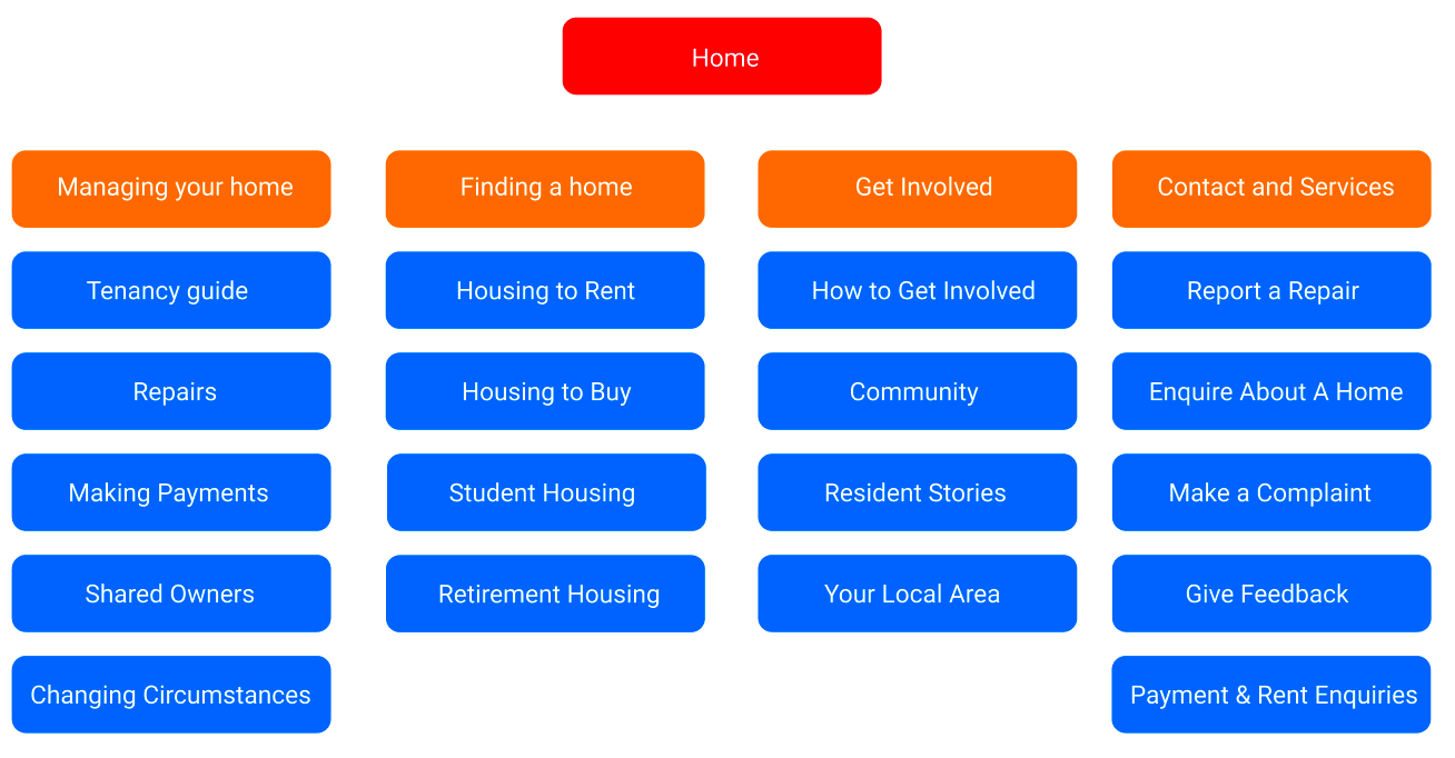
To resolve this, we wanted to segment users out at the beginning of their journey on the site by asking them to choose what type of customer they were. This meant they would only see content that was relevant for them. We designed a new navigation bar with fewer options and more sub-categories. This helped ease the user journey and point them towards the right content.
The simplified navigation bar sorts the user journeys into four key categories, directing users towards where they need to go. The key actions are then split into further audience types or actions. From these, users will then be directed to sub-domains or other pages on the site, which will have further navigation options.
Some other ideas generated were:
- Breaking up long content into more manageable chunks for improved readability
- Improving the search facility and offering related topics, giving users multiple paths to find the required content
- Providing clear calls to action to signpost users towards their goals
After the ideation stage, we created wireframes and prototypes incorporating these ideas. During usability testing, we received positive feedback on the clarity and ease of use present in the new designs. One user commented that the new designs were simple enough that even computer illiterate people would be able to find what they needed. In future iterations of the website, these UX updates will hopefully bring a much more streamlined, intuitive digital experience. We’re expecting many fewer rage clicks to be recorded as a result of these changes.
What Can We Learn from Rage Clicks?
It can be dismaying to see such a clear sign of a frustrated user on your website when you’re observing a session, but it provides a valuable learning opportunity. The nature of this action means it is often targeted on very concentrated areas of the interface. This means you’ll be able to zone in on very specific parts of your website and identify exactly what is causing frustration.
By looking a little deeper into the rage clicks, you’ll identify actionable steps to take to make the UI more clear, accessible, and intuitive. Even simple changes can make a huge impact on the quality of the customer experience. In turn, this can make a big difference to your conversion rates and business goals.


